Maps & geospatial data
1 library(tidyverse)
2 library(sf)
3 library(ggspatial)
Everyone loves a map. Whether you’re publishing a blog post, an academic article, or a data visualization, they’re (almost) always a great way to show off your skills. However, they can be a major pain to make and get right.
Let’s get right into it!
Getting country boundaries the easy way with `rnaturalearth`
A nice, easy way of getting country or region boundaries is the
rnaturalearth package. Natural
Earth is a great resource for this
kind of data, and this package is just an easy way to import it.
1 library(rnaturalearth)
One function imported with this package is the ne_countries()
function, which allows you to get country boundaries. You can specify
the scale of the data you want, and the continent you want to get. If
you don’t specify a continent, you’ll get the whole world.
hHe data comes in different levels of detail, and the 110 scale is the least-detailed version you can get, but it’s good enough for our use case. (There is also 50 and 10 scale)
1 asia <- ne_countries(scale = 110, continent = "asia")
If you want high resolution map data, you’ll have to download the
rnaturalearthhires package from Github.
You can do this with the devtools package, which installs the package
from Github.
1 library(devtools)
2 3 install_github("ropensci/rnaturalearthhires")
4 5 asia <- ne_countries(scale = 10, continent = "asia")
But what are we looking at here? This is just a normal data frame that includes one special column, ‘geometry’. Each geometry value is a polygon depicting the shape of the country.
We also, as a nice bonus, get a whole bunch of other data from Natural Earth, such as the population, name in many different languages, ISO codes, and region.
# A tibble: 10 × 169
featurecla   scalerank labelrank sovereignt sov_a3 adm0_dif level type  tlc
<chr>            <int>     <int> <chr>      <chr>     <int> <int> <chr> <chr>
1 Admin-0 cou…         1         3 Kazakhstan KA1           1     1 Sove… 1
2 Admin-0 cou…         1         3 Uzbekistan UZB           0     2 Sove… 1
3 Admin-0 cou…         1         2 Indonesia  IDN           0     2 Sove… 1
4 Admin-0 cou…         1         5 East Timor TLS           0     2 Sove… 1
5 Admin-0 cou…         1         4 Israel     IS1           1     2 Disp… 1
6 Admin-0 cou…         1         5 Lebanon    LBN           0     2 Sove… 1
7 Admin-0 cou…         1         5 Israel     IS1           1     2 Inde… 1
8 Admin-0 cou…         1         4 Jordan     JOR           0     2 Sove… 1
9 Admin-0 cou…         1         4 United Ar… ARE           0     2 Sove… 1
10 Admin-0 cou…         1         5 Qatar      QAT           0     2 Sove… 1
# ℹ 160 more variables: admin <chr>, adm0_a3 <chr>, geou_dif <int>,
#   geounit <chr>, gu_a3 <chr>, su_dif <int>, subunit <chr>, su_a3 <chr>,
#   brk_diff <int>, name <chr>, name_long <chr>, brk_a3 <chr>, brk_name <chr>,
#   brk_group <chr>, abbrev <chr>, postal <chr>, formal_en <chr>,
#   formal_fr <chr>, name_ciawf <chr>, note_adm0 <chr>, note_brk <chr>,
#   name_sort <chr>, name_alt <chr>, mapcolor7 <int>, mapcolor8 <int>,
#   mapcolor9 <int>, mapcolor13 <int>, pop_est <dbl>, pop_rank <int>, …
Generally, you don’t want to touch these geometry columns, just let them do their own thing behind the scenes. They’re just big lists of numbers that describe the shape of the country.
[1] "MULTIPOLYGON (((87.35997 49.21498, 86.59878 48.54918, 85.76823 48.45575, 85.72048 47.45297, 85.16429 47.00096, 83.18048 47.33003, 82.45893 45.53965, 81.94707 45.31703, 79.96611 44.91752, 80.86621 43.18036, 80.18015 42.92007, 80.25999 42.35, 79.64365 42.49668, 79.14218 42.85609, 77.65839 42.96069, 76.00035 42.98802, 75.63696 42.8779, 74.21287 43.29834, 73.6453 43.09127, 73.48976 42.50089, 71.84464 ..."
Making maps with `sf()`
So how do we plot this geometry to a map?
With the sf package loaded, your you have access to some new
functions, including here the geom_sf() function, which allows you to
plot the data in ggplot. You don’t need to specify the aes() function
to show basic shapes.
1 asia |>
2 ggplot() +
3 geom_sf()
Just like that, we’ve made a map!
Working with cartesian coordinates
You’ll notice that the X and Y coordinates are a little different than what we’re used to: they are in decimal degrees. Whereas a lot of real-world maps work in degrees, minutes, and seconds, with 60 minutes in a degree, and 60 seconds in a minute, these maps are in the base-10 equivalent.
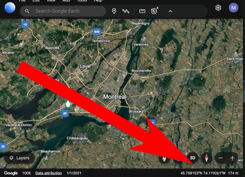
For example, New York City is at 40°42′46″North, 74°0′22″ West, or 40.712778, -74.006111 in decimal degrees. Google Earth is a good place to find these, the longitude and latitude will show up in the lower right corner.
In the settings, you might have to change it to decimal degrees.
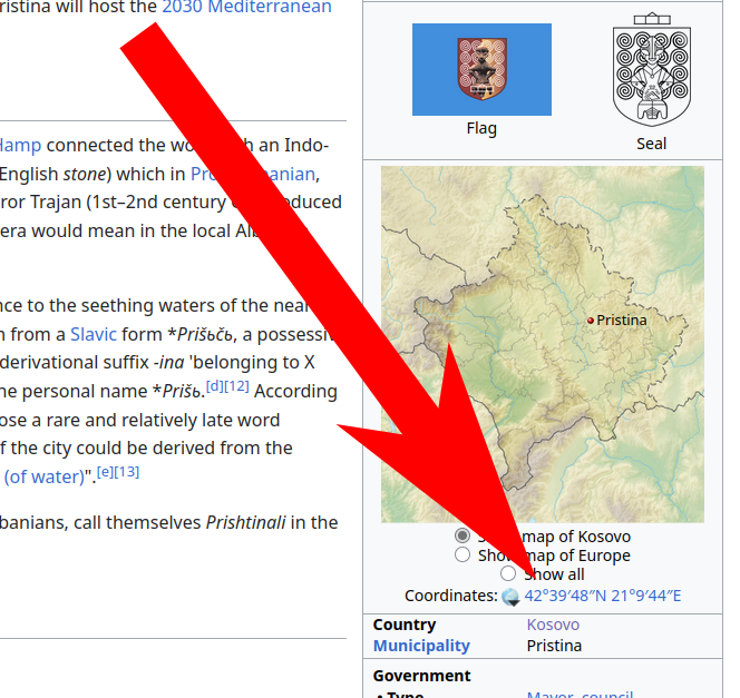
If you need the coordinates of a location, Wikipedia is also a pretty good resource.
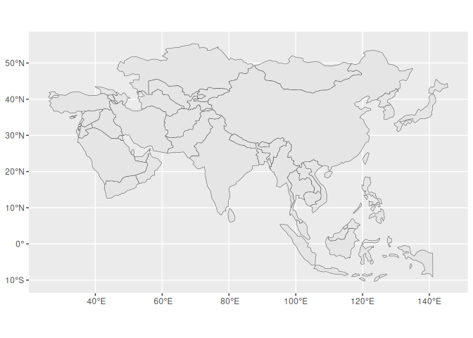
It’s easy to get mixed up about Longitude and Latitude and X and Y, so here are a couple tricks:
Remember that Lats lay Flat!
And that Y has 3 lines, lat has 3 letters!
Code
1 asia |>
2 ggplot() +
3 geom_sf() +
4 coord_sf(xlim = c(90, 145), ylim = c(-15, 30), expand = FALSE) +
5 geom_hline(yintercept = 10, color = "#44bb22", linewidth = 2) +
6 geom_label(aes(x = 95, y = 10, label = "10° North"), color = "#44bb22", hjust = 0) +
7 geom_hline(yintercept = 0, color = "#114455", linewidth = 2) +
8 geom_label(aes(x = 95, y = 0, label = "0°, the Equator!"), color = "#114455", hjust = 0) +
9 geom_hline(yintercept = -5, color = "#2244bb", linewidth = 2) +
10 geom_label(aes(x = 95, y = -5, label = "5° South (-5)"), color = "#2244bb", hjust = 0) +
11 labs(12 title = "Lats laying flat",
13 subtitle = "Latitude lines are horizontal, but they determine how far North you are.",
14 x = "X (Longtitude)",
15 y= "Y (Latitude)") +
16 theme_minimal()
Code
1 ne_countries(scale = 110) |>
2 ggplot() +
3 geom_sf() +
4 geom_vline(xintercept = 140, color = "red", linewidth = 2) +
5 geom_label(aes(x = 140, y = -15, label = "140° East"), color = "red") +
6 geom_vline(xintercept = 0, color = "#880033", linewidth = 2) +
7 geom_label(aes(x = 0, y = 0, label = "0°, the Prime Meridian!"), color = "#880033") +
8 geom_vline(xintercept = -70, color = "#ff6600", linewidth = 2) +
9 geom_label(aes(x = -70, y = 35, label = "70° West (-70)"), color = "#ff6600") +
10 labs(11 subtitle = "Longitude lines are vertical, but they determine how far east or west you are.",
12 x= "X (Longtitude)",
13 y= "Y (Latitude)") +
14 theme_minimal()
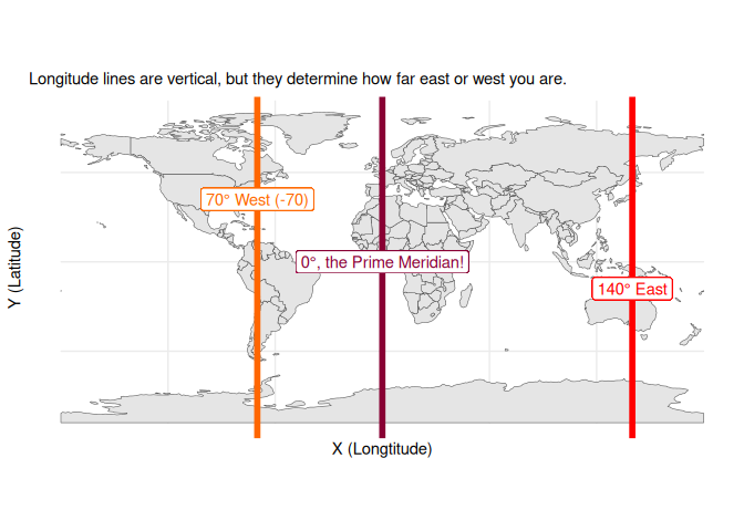
And that Long has the long lines! (and the larger numbers)
All longitude lines are the same length, and they all meet at the poles. Latitude lines are shorter as you get closer to the poles.
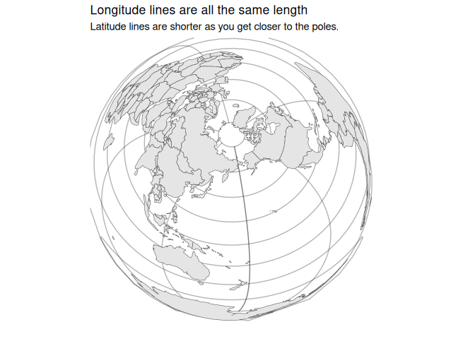
Code
1 ne_countries(scale = 110) |>
2 ggplot() +
3 geom_sf() +
4 coord_sf(crs = "+proj=laea +lon_0=168.05 +lat_0=56.59 +datum=WGS84 +units=m +no_defs") +
5 theme_minimal() +
6 theme(7 panel.grid.major = element_line(color = "#22222255", linewidth = 0.5),
8 ) +
9 labs(title= "Longitude lines are all the same length",
10 subtitle = "Latitude lines are shorter as you get closer to the poles.")
So to crop our map, we can simply set the limits of the x and y axes
with lims(), just like in any other ggplot object. Let’s focus on just
Southeast Asia for this segment. Because we’re still using ggplot, which
thinks in terms of X and Y, we’ll have to use those to set the limits.
1 asia |>
2 ggplot() +
3 geom_sf() +
4 lims(5 x = c(90, 145), # Longitude.
6 y = c(-15, 30) # Latitude.
7 )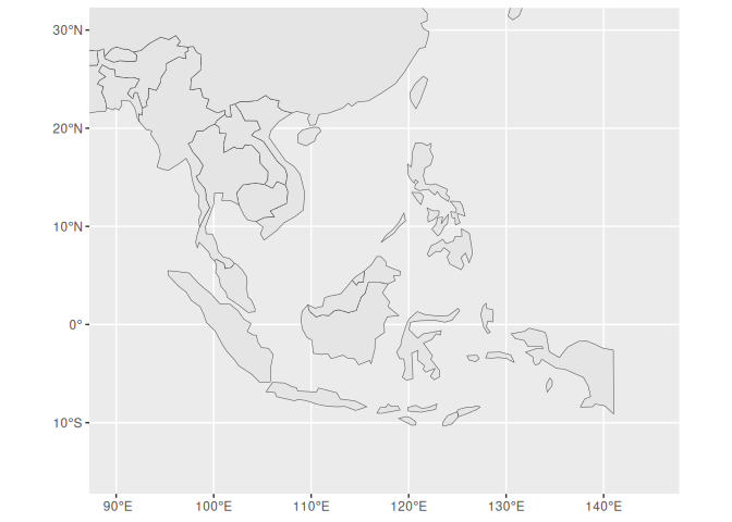
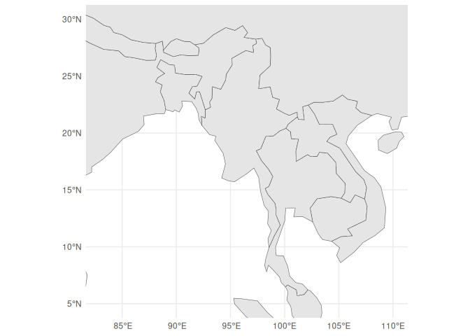
Classwork: Crop a map
- Choose a country.
- If it’s not in Asia, download the data for it using
ne_countries(). - Manually crop the map to that country and its neighbors, but loosely so that you can see the countries around it.
- Make the map square-ish.
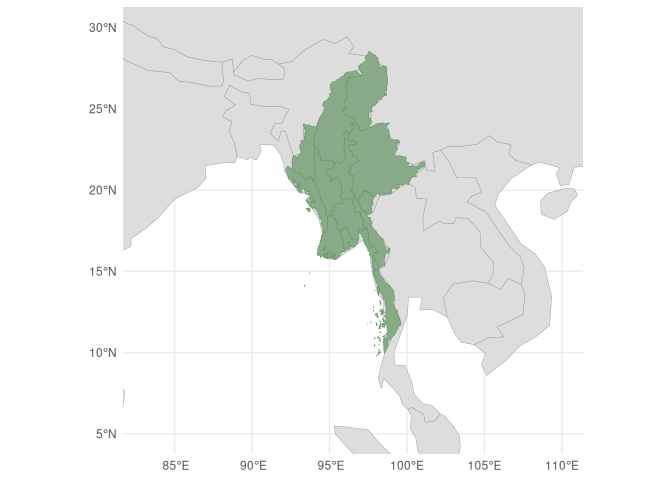
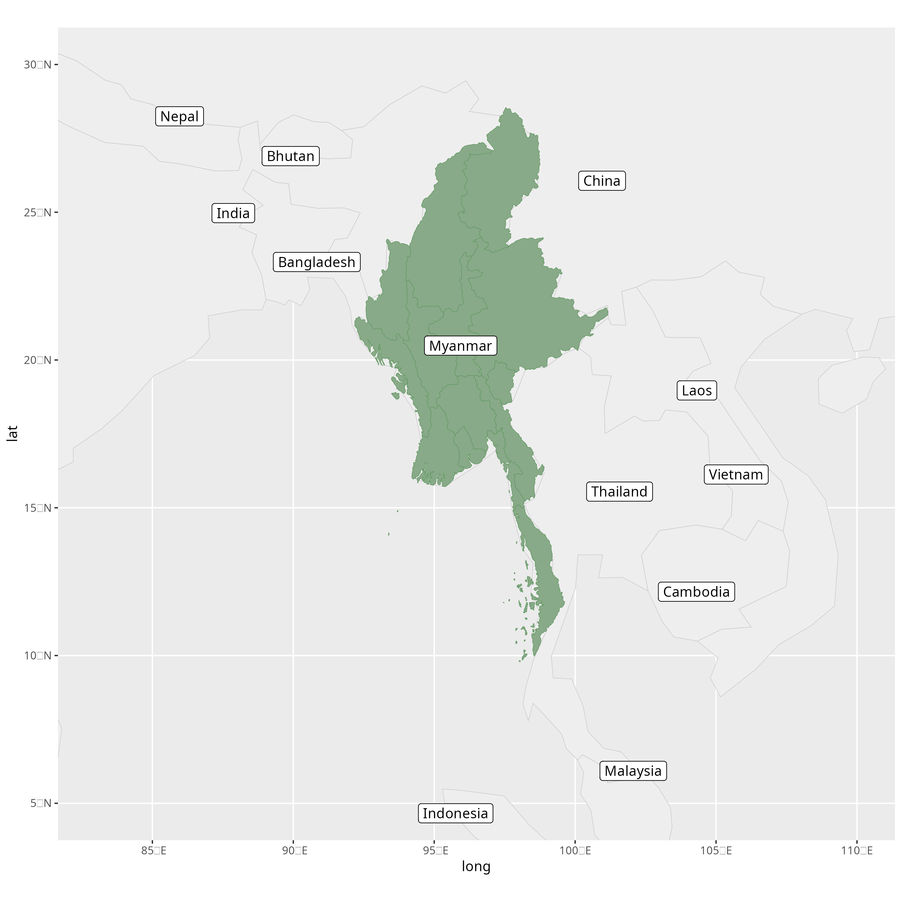
For example, I made this nice map of Myanmar:
Please do this for a country of your choice.
1 asia |>
2 ggplot() +
3 geom_sf() +
Saving 7 x 5 in image
Saving 7 x 5 in image
Saving 7 x 5 in image
Layering data from different objects
So far, we’ve been largely making our plots from one data frame at a time, but in some cases, we’ll want to layer things on top of each other. For example, what if I want to add the different states and regions of Myanmar (it has both!), and just use this as a background map?
I could first use the ne_states() function to get the states of
Myanmar:
1 mm_states <- ne_states(country = "Myanmar")
Alternatively, if you don’t have the naturalearthhires package
installed, you can use the ne_download() function to download the data
directly from Natural Earth. You can then just filter for Myanmar.
1 mm_states <- ne_download(
2 scale = 10,
3 type = "states",
4 category = "cultural"
5 )6 7 mm_states <- mm_states |>
8 filter(admin == "Myanmar")
I would then add both to a blank ggplot() object, and then add the two
layers on top of each other. I would indicate which data set to use for
each layer using the data= argument. Each layer can have its own
aes() function, so we can style each one of them separately.
1 ggplot() +
2 geom_sf(data = asia, color = "#aaaaaa", fill = "#dddddd") +
3 geom_sf(data = mm_states, color = "#669966", fill="#88aa88") +
4 lims(x = c(83, 110), y = c(5, 30)) +
5 theme_minimal()
Labeling a map the easy way with `geom_sf_label()`
Nice! But maybe our reader’s geography is terrible, and they don’t know
their Ayeyarwadys from their Tanintharyis, so we might have to add some
labels to the map. The built-in way to do this is with geom_sf_label()
or geom_sf_text(), which is a lot like geom_label() but works with
the geometry column.
1 ggplot() +
2 geom_sf(data = asia, color = "#cccccc", fill = "#eeeeee") +
3 geom_sf(data = mm_states, color = "#669966", fill="#88aa88") +
4 geom_sf_label(data = asia, aes(label = name), color = "#222222", fill="#eeeeee") +
5 lims(x = c(83, 110), y = c(5, 30)) +
6 theme_minimal()
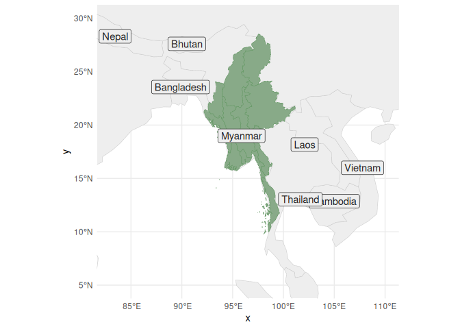
Your first reaction might be “wow, that’s some terrible overlapping, and some countries are missing!” and you’d be partially correct.
Remember that the map you see on screen is just a little preview of what
gets exported through ggsave(), and you should always look at the
final project. By saving it and opening it in an image editor, you can
see the final result. Do this before you make any irrational decisions.
If we have time at the end of class, I’ll teach you a better, but more complicated, way to label a map.
1 ggsave("images/maps/asia_map.png", width = 25, height = 25, units="cm")

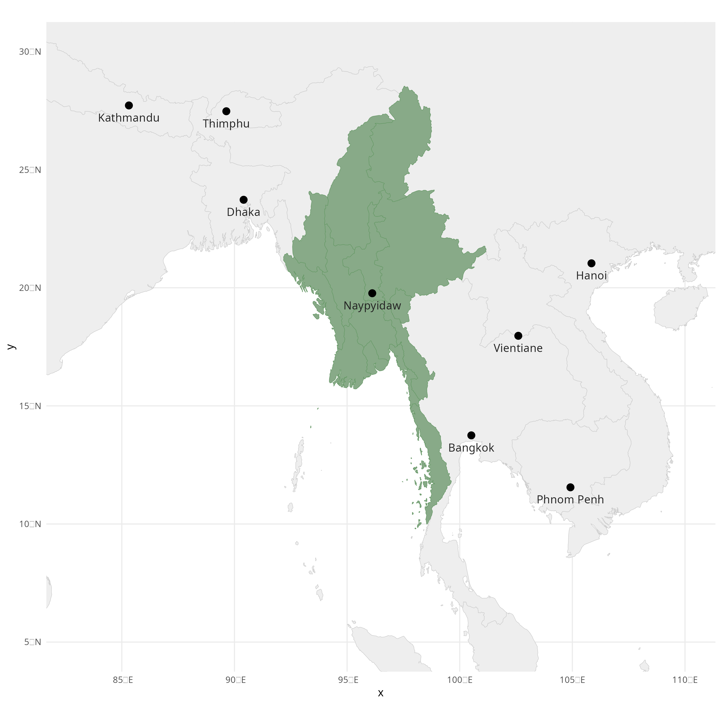
Classwork: Make a map
- Add your country of interest to the map you made previously.
- Make it a separate color from the background map, and fade the colors in the background.
- Use the following code to download the capitals of every country:
1 capital_cities <- ne_download(
2 scale = 110,
3 type = "populated_places",
4 category = "cultural"
5 ) |>
6 filter(FEATURECLA == "Admin-0 capital")
- Add the capitals to your map as as both points and labels.
- Move the labels around using
vjustandhjust, so they don’t overlap with the points. For example, this would would vertically
adjust (`vjust`) the labels down a little bit:
1 geom_sf_text(aes(label = NAME), color = "#222222", fill="#eeeeee", vjust = 2.0)
- Save it as a PNG file, and review the final project
Your result might look something like this:
Cartography can get you in a lot of trouble
Wherever you publish your data, you have to be very careful about the maps you present; some countries are very touchy about this.
This can apply to your own country, too, and can get you in some deep trouble. Wherever you publish, you’ll have to consider:
- The laws of the country you’re in,
- The laws of the country you’re publishing in,
- The laws of the country you’re from,
- The laws of any country you might want a visa for in the future,
- Your own politics and viewpoints,
- The politics and viewpoints of the people you’re publishing for,
- How many angry comments you want to get on social media,
- etc, etc, etc.
This might be completely untintentional: In the above map of Myanmar, the border between India and China is disputed, and we’ve just inadvertently taken a position on it, making this map illegal to publish under Chinese law.
This can be a real headache, and if this worries you, you might not want to publish maps at all.
Getting country data from shapefiles
These download functions are nice, but maybe you’ll need to need to get
data from some other source. The most common format for these are
shapefiles, which are a collection of files that describe the shape
of a country. These are often used in specialized GIS software, but can
be imported into R using the sf package.
For example, if you want to avoid the can of worms described above, naturalearthdata.com has shapefiles from each country’s point of view available to download directly.
The default shapefile from ne_countries() depicts Crimea as belonging
to Russia, but let’s say you want to show a map depicting it as
Ukrainian. You’ll want to:
- Download the .zip file, from, say, the Swedish perspective.
- Unzip it.
1 download.file(2 "https://naciscdn.org/naturalearth/10m/cultural/ne_10m_admin_0_countries_swe.zip",
3 "input_data/swe_perspective_shapefile.zip"4 )5 unzip(6 "input_data/swe_perspective_shapefile.zip",
7 exdir = "input_data/swe_shapefile"
8 )You’ll notice that you get 6 files, not just one. What a deal!
.
├── ne_10m_admin_0_countries_swe.dbf
├── ne_10m_admin_0_countries_swe.prj
├── ne_10m_admin_0_countries_swe.README.html
├── ne_10m_admin_0_countries_swe.shp
├── ne_10m_admin_0_countries_swe.shx
└── ne_10m_admin_0_countries_swe.VERSION.txt
1 directory, 6 files
The other folders are just metadata and database files that are
necessary for the shapefile to work, and you can ignore them for now.
The only one we care about is the .shp file, which contains the actual
data.
But if you move the file, be sure to move the other ones too, or the whole thing will break!
1 world_map_swe <- st_read("input_data/swe_shapefile/ne_10m_admin_0_countries_swe.shp")
Reading layer `ne_10m_admin_0_countries_swe' from data source
`/home/mjw/Websites/MjwSite/tutorials/data-viz-course/input_data/swe_shapefile/ne_10m_admin_0_countries_swe.shp'
using driver `ESRI Shapefile'
Simple feature collection with 250 features and 168 fields
Geometry type: MULTIPOLYGON
Dimension:     XY
Bounding box:  xmin: -180 ymin: -90 xmax: 180 ymax: 83.6341
Geodetic CRS:  WGS 84
Now, when you make a map and publish it somewhere, you’ll have an entirely different group of people angry at you in the comments sections!
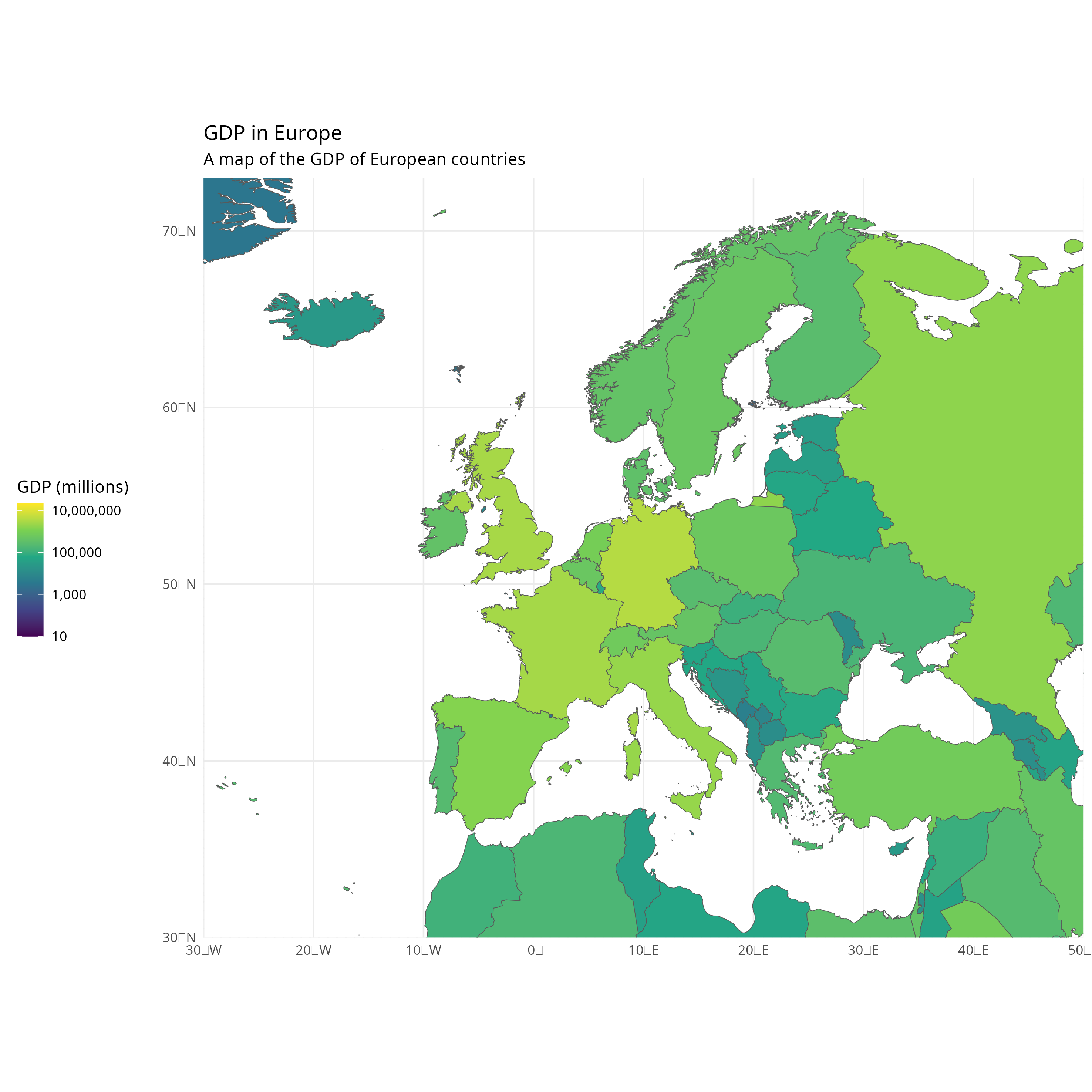
A map of European GDP from the Swedish perspective
1 world_map_swe |>
2 ggplot() +
3 geom_sf(aes(fill=GDP_MD)) +
4 coord_sf(xlim = c(-30, 50), ylim = c(30, 73), expand = FALSE) +
5 scale_fill_viridis_c(trans="log10", labels = scales::comma) +
6 labs(7 title = "GDP in Europe",
8 subtitle = "A map of the GDP of European countries",
9 x = element_blank(),
10 y= element_blank(),
11 fill = "GDP (millions)"
12 ) +
13 theme_minimal() +
14 theme(15 legend.position = "left"
16 )17 18 ggsave("images/maps/euro_map.png", width = 25, height = 25, units="cm")
Adding data from point coordinates
Sometimes, our data isn’t in a shapefile, but in a CSV or some other format. In this case, we need to do a few things to get it into a format we can use. I found here a nice .csv of solar power plants in France, from here which includes the coordinates of each plant.
1 french_solar_plants <- 2 read_csv("https://datasette.io/global-power-plants/global-power-plants.csv?country_long=France&primary_fuel=Solar&_size=max")
Rows: 817 Columns: 26
── Column specification ────────────────────────────────────────────────────────
Delimiter: ","
chr  (8): country, country_long, name, gppd_idnr, primary_fuel, source, url,...
dbl  (6): rowid, capacity_mw, latitude, longitude, wepp_id, estimated_genera...
lgl (12): other_fuel1, other_fuel2, other_fuel3, commissioning_year, owner, ...
ℹ Use `spec()` to retrieve the full column specification for this data.
ℹ Specify the column types or set `show_col_types = FALSE` to quiet this message.
1 french_solar_plants |>
2 select(name, longitude, latitude, everything())
# A tibble: 817 × 26
name      longitude latitude rowid country country_long gppd_idnr capacity_mw
<chr>         <dbl>    <dbl> <dbl> <chr>   <chr>        <chr>           <dbl>
1 Agde          3.48      43.3 10297 FRA     France       WRI10256…        1.16
2 Aghione       9.41      42.1 10299 FRA     France       WRI10246…        8.53
3 Aghione 2     9.40      42.1 10300 FRA     France       WKS00705…        4
4 Aghione 3     9.4       42.1 10301 FRA     France       WKS00695…       12
5 Aigaliers     4.31      44.1 10303 FRA     France       WKS00690…       10.9
6 Aigrefeu…    -0.944     46.1 10304 FRA     France       WRI10252…        2.19
7 Aiguillon     0.358     44.3 10306 FRA     France       WRI10251…        2.58
8 Aire-sur…    -0.264     43.7 10309 FRA     France       WRI10252…        2.24
9 Aix-en-P…     5.40      43.5 10311 FRA     France       WRI10246…        8.36
10 Aizenay      -1.63      46.7 10312 FRA     France       WRI10255…        1.37
# ℹ 807 more rows
# ℹ 18 more variables: primary_fuel <chr>, other_fuel1 <lgl>,
#   other_fuel2 <lgl>, other_fuel3 <lgl>, commissioning_year <lgl>,
#   owner <lgl>, source <chr>, url <chr>, geolocation_source <chr>,
#   wepp_id <dbl>, year_of_capacity_data <lgl>, generation_gwh_2013 <lgl>,
#   generation_gwh_2014 <lgl>, generation_gwh_2015 <lgl>,
#   generation_gwh_2016 <lgl>, generation_gwh_2017 <lgl>, …
To put this on our map properly, we need to convert the longitude and
latitude columns into a geometry column. We can do this using the
st_as_sf() function, which takes a data frame and converts it into a
spatial object.
We also need to set the coordinate reference system (CRS), which is the system that describes how the coordinates are defined. The most common one is WGS84, so we’re just going to hope it’s correct.
1 french_solar_plants <- french_solar_plants |>
2 st_as_sf(coords = c("longitude", "latitude"), crs = 4326)
Now we can add the power plants to our map using the geom_sf()
function, just like we did with the countries.
I’ve also cropped it to just metropolitan France, so we can see the power plants better.
1 ggplot() +
2 geom_sf(data=world_map_swe) +
3 geom_sf(data=french_solar_plants) +
4 lims(x = c(-7, 12), y = c(41, 52))
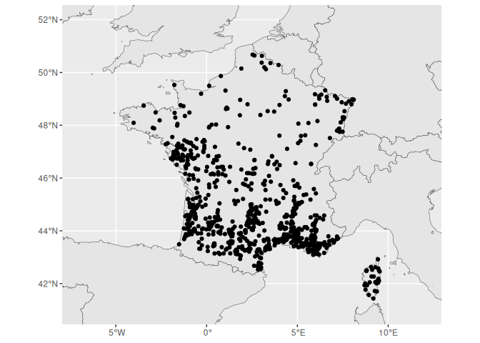
Ok, not a bad start, but maybe a little bit too busy.
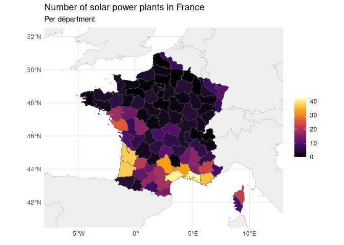
Because there are so many solar power plants, maybe we can handle them a little differently, and make a cloropleth map of the number of plants in each region. We can do this by grouping the data by region, and then counting the number of plants in each french department.
Spatial computation
Preparing our data
First, we need to get the department boundaries of France, which I’ll once again take from Natural Earth.
We only want some administrative codes, the names, and the geometry, so I remove everything else.
1 france_depts <- 2 ne_states(country = "France", returnclass = "sf") |>
3 select(adm1_code, name_fr, geometry)
4 france_depts
Simple feature collection with 101 features and 2 fields
Geometry type: MULTIPOLYGON
Dimension:     XY
Bounding box:  xmin: -61.79784 ymin: -21.37078 xmax: 55.8545 ymax: 51.08754
Geodetic CRS:  WGS 84
First 10 features:
adm1_code                 name_fr                       geometry
47   FRA-2000                  Guyane MULTIPOLYGON (((-54.21118 3...
200  FRA-5330                    Nord MULTIPOLYGON (((2.5218 51.0...
203  FRA-5268                Ardennes MULTIPOLYGON (((4.815551 50...
205  FRA-5263                   Aisne MULTIPOLYGON (((4.131665 49...
207  FRA-5326                   Meuse MULTIPOLYGON (((5.391166 49...
208  FRA-5325      Meurthe-et-Moselle MULTIPOLYGON (((5.477724 49...
246  FRA-5328                 Moselle MULTIPOLYGON (((6.345307 49...
432  FRA-5266         Alpes-Maritimes MULTIPOLYGON (((7.687932 44...
434  FRA-5265 Alpes-de-Haute-Provence MULTIPOLYGON (((6.9383 44.6...
435  FRA-5304            Hautes-Alpes MULTIPOLYGON (((7.038819 44...
Next, I’m going to make a temporary data frame with the geometry and the row id of the solar power plants.
Some of these data sets get absolutely massive, so I try to keep my data frames as slim as possible.
1 solar_plants_temp <- french_solar_plants |>
2 select(geometry, rowid)
3 4 solar_plants_temp
Simple feature collection with 817 features and 1 field
Geometry type: POINT
Dimension:     XY
Bounding box:  xmin: -61.7288 ymin: -21.3194 xmax: 55.8058 ymax: 50.6767
Geodetic CRS:  WGS 84
# A tibble: 817 × 2
geometry rowid
<POINT [°]> <dbl>
1  (3.4846 43.3094) 10297
2  (9.4119 42.0986) 10299
3  (9.3986 42.0849) 10300
4      (9.4 42.096) 10301
5    (4.307 44.068) 10303
6 (-0.9444 46.1165) 10304
7  (0.3577 44.3009) 10306
8 (-0.2643 43.6991) 10309
9  (5.3984 43.5361) 10311
10 (-1.6268 46.7385) 10312
# ℹ 807 more rows
Perfoming a spatial join with `st_join()`
The sf library also comes with a variety of functions starting with
“st_”, which are used to perform spatial operations. I can’t find it in
the documentation anywhere, but I
assume it stands for “spatial transformation.” One of these is
st_join(), which allows you to join two data frames based on their
location.
Just like a normal join, you can use it to combine two data frames based on a common feature. In this case, we want to join the solar power plants with the department boundaries, so we can count the number of solar power plants in each department.
In this case, we use st_join to tell us which department of France each solar power plant is in.
1 solar_plant_count <- st_join(solar_plants_temp, france_depts)
2 3 solar_plant_count
Simple feature collection with 817 features and 3 fields
Geometry type: POINT
Dimension:     XY
Bounding box:  xmin: -61.7288 ymin: -21.3194 xmax: 55.8058 ymax: 50.6767
Geodetic CRS:  WGS 84
# A tibble: 817 × 4
geometry rowid adm1_code name_fr
*       <POINT [°]> <dbl> <chr>     <chr>
1  (3.4846 43.3094) 10297 FRA-5307  Hérault
2  (9.4119 42.0986) 10299 FRA-5297  Haute-Corse
3  (9.3986 42.0849) 10300 FRA-5297  Haute-Corse
4      (9.4 42.096) 10301 FRA-5297  Haute-Corse
5    (4.307 44.068) 10303 FRA-5293  Gard
6 (-0.9444 46.1165) 10304 FRA-5278  Charente-Maritime
7  (0.3577 44.3009) 10306 FRA-5319  Lot-et-Garonne
8 (-0.2643 43.6991) 10309 FRA-5313  Landes
9  (5.3984 43.5361) 10311 FRA-5274  Bouches-du-Rhône
10 (-1.6268 46.7385) 10312 FRA-5353  Vendée
# ℹ 807 more rows
What we get is a data frame with the geometry of the department, and the row id of the solar power plant.
Dropping our geometry layer with `st_drop_geometry()`
We no longer need the geometry of the solar power plants, so we can drop
it using the st_drop_geometry() function. This will remove the
geometry column from the data frame, and leave us with just the
department boundaries and the row id of the solar power plants.
It is still a spatial object, so we can turn it back into a normal data
frame with as_tibble().
1 solar_plant_count <- solar_plant_count |>
2 st_drop_geometry() |>
3 as_tibble()
4 5 solar_plant_count
# A tibble: 817 × 3
rowid adm1_code name_fr
<dbl> <chr>     <chr>
1 10297 FRA-5307  Hérault
2 10299 FRA-5297  Haute-Corse
3 10300 FRA-5297  Haute-Corse
4 10301 FRA-5297  Haute-Corse
5 10303 FRA-5293  Gard
6 10304 FRA-5278  Charente-Maritime
7 10306 FRA-5319  Lot-et-Garonne
8 10309 FRA-5313  Landes
9 10311 FRA-5274  Bouches-du-Rhône
10 10312 FRA-5353  Vendée
# ℹ 807 more rows
Now we can simply use the count() function to count the number of
solar power plants in each department.
1 solar_plant_count <- solar_plant_count |>
2 count(adm1_code)
3 4 solar_plant_count
# A tibble: 86 × 2
adm1_code     n
<chr>     <int>
1 FRA-1442     11
2 FRA-2000      9
3 FRA-4601     16
4 FRA-4602      2
5 FRA-4603     12
6 FRA-5264     10
7 FRA-5265     23
8 FRA-5266      9
9 FRA-5267     13
10 FRA-5269      8
# ℹ 76 more rows
We want to use this data to color our cloropleth map, so we need to join
it back to the department boundaries. We can do this using the normal
old left_join() function, which will add the number of solar power
plants to each department.
I’ve also renamed the column to something a little bit more descriptive.
1 france_depts <- france_depts |>
2 left_join(solar_plant_count, by = "adm1_code") |>
3 rename(solar_count = n)
4 5 france_depts
Simple feature collection with 101 features and 3 fields
Geometry type: MULTIPOLYGON
Dimension:     XY
Bounding box:  xmin: -61.79784 ymin: -21.37078 xmax: 55.8545 ymax: 51.08754
Geodetic CRS:  WGS 84
First 10 features:
adm1_code                 name_fr solar_count                       geometry
1   FRA-2000                  Guyane           9 MULTIPOLYGON (((-54.21118 3...
2   FRA-5330                    Nord           8 MULTIPOLYGON (((2.5218 51.0...
3   FRA-5268                Ardennes          NA MULTIPOLYGON (((4.815551 50...
4   FRA-5263                   Aisne          NA MULTIPOLYGON (((4.131665 49...
5   FRA-5326                   Meuse          NA MULTIPOLYGON (((5.391166 49...
6   FRA-5325      Meurthe-et-Moselle           3 MULTIPOLYGON (((5.477724 49...
7   FRA-5328                 Moselle           8 MULTIPOLYGON (((6.345307 49...
8   FRA-5266         Alpes-Maritimes           9 MULTIPOLYGON (((7.687932 44...
9   FRA-5265 Alpes-de-Haute-Provence          23 MULTIPOLYGON (((6.9383 44.6...
10  FRA-5304            Hautes-Alpes           6 MULTIPOLYGON (((7.038819 44...
We can see that this still leaves us with some NA values, which we can
clean up using replace_na()
1 france_depts <- france_depts |>
2 mutate(solar_count = replace_na(solar_count, 0))
3 4 france_depts
Simple feature collection with 101 features and 3 fields
Geometry type: MULTIPOLYGON
Dimension:     XY
Bounding box:  xmin: -61.79784 ymin: -21.37078 xmax: 55.8545 ymax: 51.08754
Geodetic CRS:  WGS 84
First 10 features:
adm1_code                 name_fr solar_count                       geometry
1   FRA-2000                  Guyane           9 MULTIPOLYGON (((-54.21118 3...
2   FRA-5330                    Nord           8 MULTIPOLYGON (((2.5218 51.0...
3   FRA-5268                Ardennes           0 MULTIPOLYGON (((4.815551 50...
4   FRA-5263                   Aisne           0 MULTIPOLYGON (((4.131665 49...
5   FRA-5326                   Meuse           0 MULTIPOLYGON (((5.391166 49...
6   FRA-5325      Meurthe-et-Moselle           3 MULTIPOLYGON (((5.477724 49...
7   FRA-5328                 Moselle           8 MULTIPOLYGON (((6.345307 49...
8   FRA-5266         Alpes-Maritimes           9 MULTIPOLYGON (((7.687932 44...
9   FRA-5265 Alpes-de-Haute-Provence          23 MULTIPOLYGON (((6.9383 44.6...
10  FRA-5304            Hautes-Alpes           6 MULTIPOLYGON (((7.038819 44...
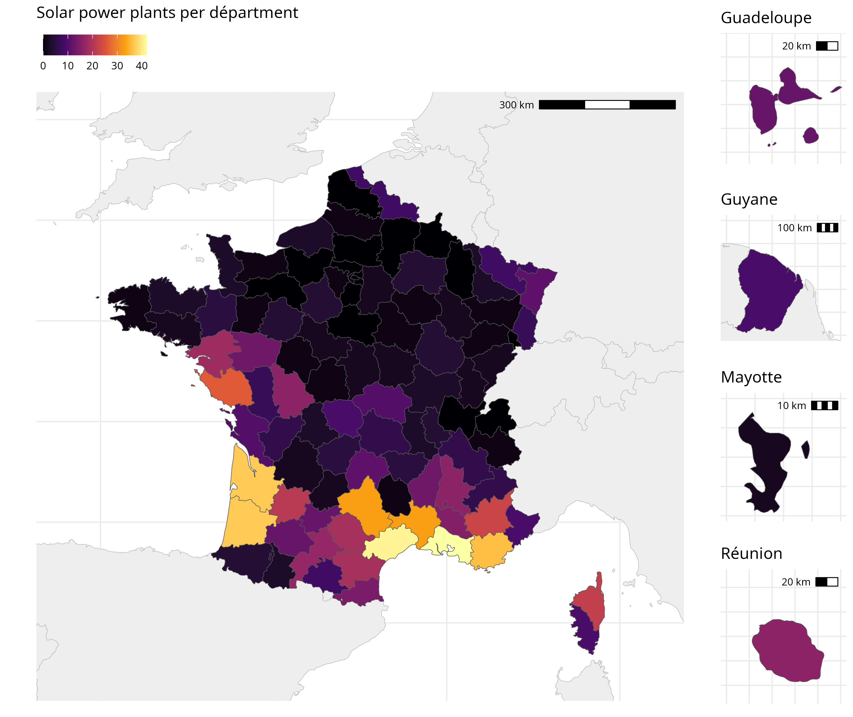
When we plot this, we can see that we’ve successfully counted up the number of solar power plants in each department.
1 ggplot() +
2 geom_sf(data = world_map_swe, color = "#bbbbbb", fill = "#eeeeee") +
3 geom_sf(data = france_depts, aes(fill = solar_count)) +
4 lims(x = c(-7, 12), y = c(41, 52)) +
5 theme_minimal() +
6 labs(7 title = "Number of solar power plants in France",
8 subtitle = "Per départment",
9 x = element_blank(),
10 y= element_blank(),
11 fill = "Number of solar power plants"
12 ) +
13 theme(14 legend.position = "right",
15 legend.title = element_blank(),
16 ) +
17 scale_fill_viridis_c(option="B")
There’s a lot, lot more to talk about with this sort of things, and the whole field of GISc is devoted to it. Things get really complicated really fast, and R isn’t necessarily the best tool to solve the crazy complicated problems. However, it is good enough for 90% of use cases.
Combining plots
But somebody in Saint Pierre and Miquelon is already shouting
“Tabarnouche! We are part of France too!” and they are right. So let’s
add the overseas territories to the map. We can do this with the
cowplot library, which allows you to combine multiple ggplot objects
into one.
We need to make separate plots for some overseas territories, and save them as different environment variables. But how can we do this?
I would first save a map with no limits set, and also the legend and title removed. We do this to have as much of the map as possible in one block of code, so that if we have to, say, change the colors, we don’t have to edit every single sub-map.
I’ve also added a scale bar in the top right using the
annotation_scale(location = 'tr') function from the ggspatial package.
1 all_france_plot <- ggplot() +
2 geom_sf(data = world_map_swe, color = "#bbbbbb", fill = "#eeeeee") +
3 geom_sf(data = france_depts, aes(fill = solar_count)) +
4 theme_minimal() +
5 scale_fill_viridis_c(option="B") +
6 theme(7 legend.position = "none",
8 legend.title = element_blank(),
9 axis.text = element_blank(),
10 ) +
11 annotation_scale(location = 'tr')
12 13 all_france_plot
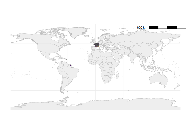
I would then make the main map, and add the legend, title, etc. to that one.
1 plt_metro <- all_france_plot +
2 lims(x = c(-6, 11), y = c(41, 52)) +
3 labs(4 title = "Solar power plants per départment",
5 x = element_blank(),
6 y= element_blank(),
7 fill = "Number of solar power plants"
8 ) +
9 theme(10 legend.position='top',
11 legend.justification='left',
12 legend.direction='horizontal',
13 )14 15 plt_metro
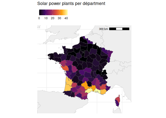
You’ll get a warning saying “Scale on map varies by more than 10%, scale bar may be inaccurate,” and this is correct.
This is because we’re using the Mercator projection, which distorts the size of the countries as you get further from the equator. However, this is still good to include to give viewers a rough ballpark of how big the different territories are.
I would then make separate plots for each overseas territory I wanted to include.
For the sake of this example, I will just choose 4. I make them all the same dimensions (no super long or tall maps), so that the final map doesn’t look so wonky.
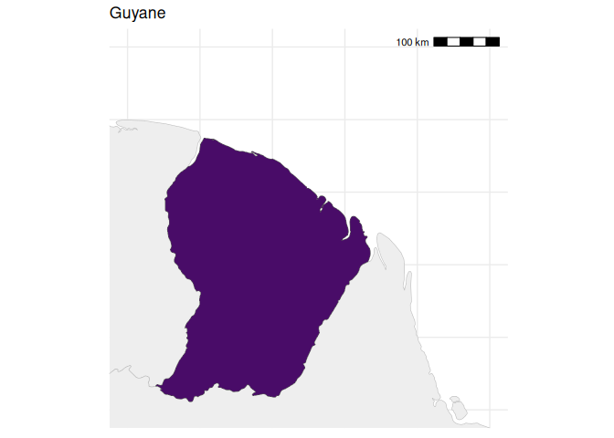
1 plt_guyana <- all_france_plot +
2 lims(x = c(-55, -50), y = c(2, 7)) +
3 labs(title = "Guyane")
4 5 plt_guyana
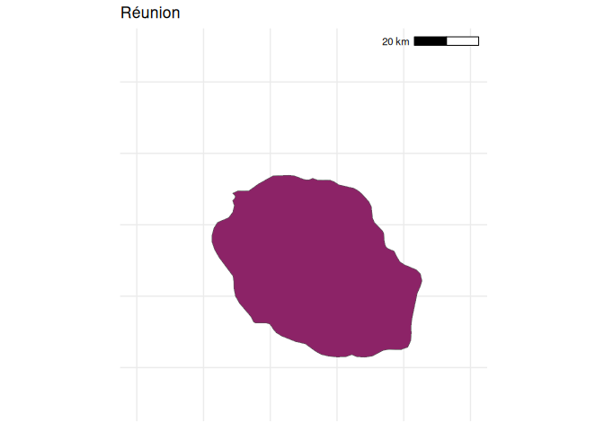
1 plt_reunion <- all_france_plot +
2 lims(x = c(55, 56), y = c(-21.5, -20.5)) +
3 labs(title = "Réunion")
4 5 plt_reunion
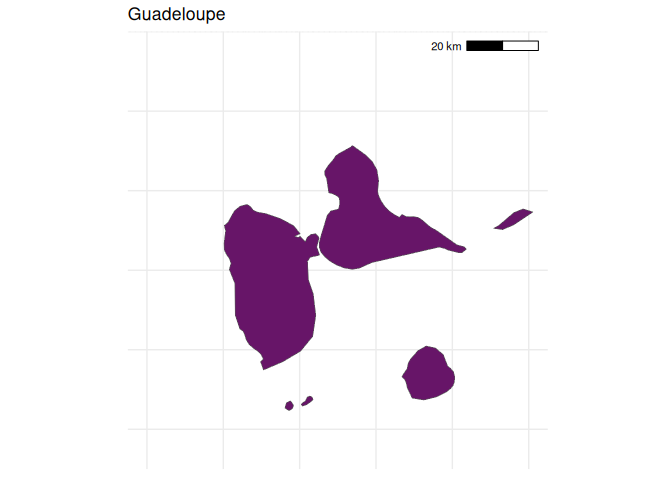
1 plt_guadeloupe <- all_france_plot +
2 lims(x = c(-62, -61), y = c(15.75, 16.75)) +
3 labs(title = "Guadeloupe")
4 5 plt_guadeloupe
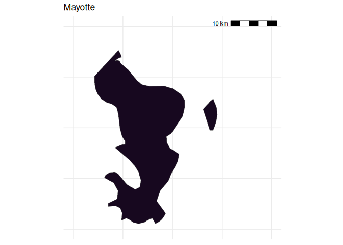
1 plt_mayotte <- all_france_plot +
2 lims(x = c(45, 45.4), y = c(-13, -12.6)) +
3 labs(title = "Mayotte")
4 5 plt_mayotte
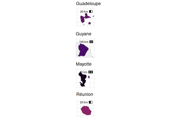
Next, we can combine the plots using the plot_grid() function from the
cowplot package. This allows us to arrange the plots in a grid, and
specify how many columns we want. For example, I want all the overseas
territories in one column, so I set ncol = 1.
1 library(cowplot)
Attaching package: 'cowplot'
The following object is masked from 'package:lubridate':
stamp
1 overseas <- plot_grid(
2 plt_guadeloupe, plt_guyana, plt_mayotte, plt_reunion,
3 ncol = 1
4 )5 6 overseas
Finally, we add this to the side of the main plot. Because we want the
main plot to be larger, we fiddle around with the relative widths of the
two plots using rel_widths. Each plot is assigned a width, with a
larger number meaning a wider plot.
1 plt_final <- plot_grid(
2 plt_metro, overseas,
3 ncol = 2,
4 rel_widths = c(1, 0.2)
5 )Again, because we only care about the final output, we can save this to
a file using ggsave(), and only examine the final output.
1 ggsave("images/maps/all_france_solar.png", plt_final, w=25, h=21, units="cm")
Extra: coordinate systems
By default, sf uses the WGS84 coordinate system, which plots the data
onto a rectangular grid. However, while this is very useful for
navigating a boat across the ocean, it is not always the best way to
plot data on a map; locations near the poles are too large and too flat,
and distances are heavily distorted.
Using the coord_sf() function, you can set the coordinate system to
something more appropriate for your data. For example, this code
re-projects our world map to the Robinson projection, which abandons the
rigid grid of the Mercator and better preserves the shape of the
continents.
1 world_map_swe |>
2 ggplot() +
3 geom_sf(color = "#00000000", fill = "#222222") +
4 coord_sf(crs = "+proj=robin +lon_0=0w") +
5 theme_minimal() +
6 theme(panel.grid.major = element_line(color = "#222222", linewidth = 0.5))
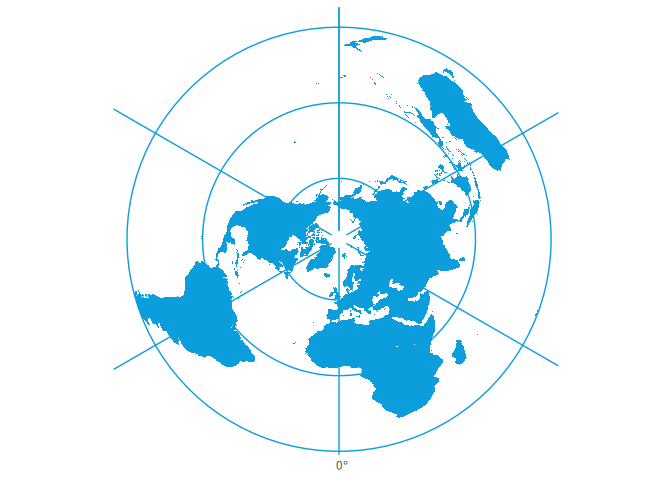
Or here’s the UN map (a Polar azimuthal equidistant projection).
1 world_map_swe |>
2 st_crop(ymin = -50, ymax = 90, xmin = -180, xmax = 180) |>
3 ggplot() +
4 geom_sf(color = "#00000000", fill = "#0c9edc") +
5 coord_sf(6 crs = "+proj=aeqd +lon_0=0 +lat_0=90 +datum=WGS84 +units=m +no_defs"
7 ) +
8 theme_minimal() +
9 theme(panel.grid.major = element_line(color = "#0c9edc", linewidth = 0.5))
All these are done with special codes passed to the coord_sf()
function. You can find a list of all the different projections
here.
Some countries have an official projection, which might be nice to use for your maps. For example, Switzerland has theSwiss Oblique Mercator.
A useful tool for generating these codes can be found at projectionwizard.org.
Extra: An ultra-handy debugging tip
The largest problem with cartography is the issue of projecting spherical coordinates onto a flat plane. R can sometimes struggle with this, ans has two different methods of doing so. If you’re getting weird errors, try switching between the two methods using these commands:
You can read about what they mean yourself if you want to.
1 sf_use_s2(FALSE)
1 sf_use_s2(TRUE)
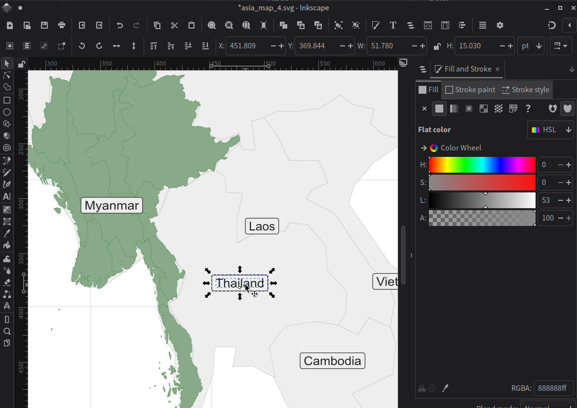
Extra: Map labeling solution No. 1
Back to our map of Myanmar!
Labeling our map correctly is honestly really hard sometimes. The easiest, and often the best way, is simply to export the map as an .svg file, and edit it in a vector graphics editor like Inkscape (free!) or Adobe Illustrator.
While I’m generally an advocate for the “spend 2 hours automating a task rather than spend 1 hour doing it manually” approach to computing, this is one of those cases where it really is easier to just do it by hand.
1 ggplot() +
2 geom_sf(data = asia, color = "#cccccc", fill = "#eeeeee") +
3 geom_sf(data = mm_states, color = "#669966", fill="#88aa88") +
4 geom_sf_label(data = asia, aes(label = name), color = "#222222", fill="#eeeeee") +
5 lims(x = c(83, 110), y = c(5, 30)) +
6 theme_minimal()
7 8 ggsave("images/maps/asia_map_4.svg", width = 25, height = 25, units="cm")
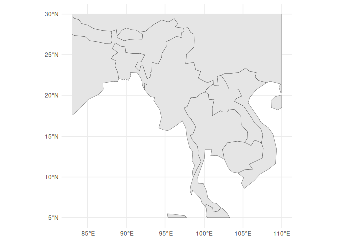
Extra: Limits or cropping
If you want to crop the map to a specific area, you can use the
st_crop() function. This will crop the map to a specific bounding box,
which is defined by the minimum and maximum x and y coordinates.
This gets rid of all the data not within that bounding box, which can be helpful in many situations.
1 asia_cropped <- st_crop(asia, xmin = 83, xmax = 110, ymin = 5, ymax = 30)
although coordinates are longitude/latitude, st_intersection assumes that they
are planar
Warning: attribute variables are assumed to be spatially constant throughout
all geometries
1 asia_cropped |>
2 ggplot() +
3 geom_sf() +
4 coord_sf() +
5 theme_minimal()
Extra: Map labeling solution No. 2
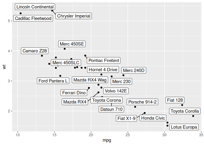
Ok, you say, but I really want to do this in R. I get it.
There exists a great library for labeling called ggrepel. Using its
geom_label_repel() function, we can add labels to anything on a plot.
If there are too many labels in an area, it will automatically move them
around so they don’t overlap. If there are still too many, it will leave
some unlabeled.
1 library(ggrepel)
2 3 mtcars |>
4 ggplot() +
5 geom_point(aes(mpg, wt)) +
6 geom_label_repel(aes(mpg, wt, label = rownames(mtcars)))
However, it doesn’t work with geom_sf_label(), so we have to do a
little bit of cheating.
First, we need to get the center points (centroids) of each country in
the asia data frame. We can do this using the st_centroid()
function, which will give us the center of each country.
1 asia_centroids <- asia_cropped |>
2 select(name) |>
3 st_centroid()
We use st_centroid() on the asia_cropped data frame, which is the
cropped version of the asia data frame. This will give us the center
of each country in the cropped area. This prevents our centroid for
China and India from being in the center of the country, but instead in
the center of the part of that country seen on the map. This will keep
the labels on our map.
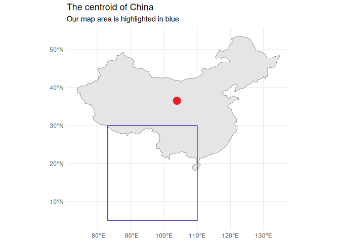
The centroid of China.
1 ggplot() +
2 geom_sf(data = asia |> filter(name == "China")) +
3 # Don't code like this, kids.4 geom_sf(data = asia |> filter(name == "China") |> st_centroid(), color = "#EE1C25", size = 5) +
5 geom_rect(aes(xmin = 83, xmax = 110, ymin = 5, ymax = 30), color = "#2222aa", fill = NA) +
6 labs(7 title = "The centroid of China",
8 subtitle = "Our map area is highlighted in blue",
9 ) +
10 theme_minimal()
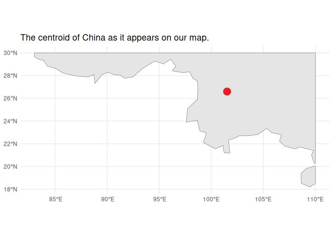
The centroid of China as it appears on our map.
1 asia_centroids |>
2 filter(name == "China") |>
3 ggplot() +
4 geom_sf(data = asia_cropped |> filter(name == "China")) +
5 geom_sf(data = asia_centroids |> filter(name == "China"), color = "#EE1C25", size = 5) +
6 labs(7 title = "The centroid of China as it appears on our map."
8 ) +
9 theme_minimal()
Next, we need to get the coordinates of each centroid, which we can do
using the st_coordinates() function.
st_coordinates() returns a list of X Y, (and maybe Z: elevation and M:
measure), so we need to use some janky code to get the longitude and
latitude for each centroid.
1 asia_centroids <- asia_centroids |>
2 mutate(long = st_coordinates(geometry)[,1],
3 lat = st_coordinates(geometry)[,2]
4 ) |>
5 st_drop_geometry() |>
6 as_tibble()
7 8 asia_centroids
Now, assuming we haven’t touched our coordinate system at all, we can
overlay the centroids on top of the map using geom_label_repel().
1 ggplot() +
2 geom_sf(data = asia, color = "#cccccc", fill = "#eeeeee") +
3 geom_sf(data = mm_states, color = "#669966", fill="#88aa88") +
4 lims(x = c(83, 110), y = c(5, 30)) +
5 geom_label_repel(data = asia_centroids, aes(x = long, y = lat, label = name))
6 7 ggsave("images/maps/asia_map_5.png", width = 25, height = 25, units="cm")
Practice and Homework
- Make a map of your choice. It can be as simple or as complicated as you want.
- Please email me the code you used to make your map in a document named week_9_homework_(your_name).R by Tuesday, April 6th.
- Please also include your final map as a PNG or JPG file.