GGplot 1: Basic charts and graphs
We’ve finally done it! We’ve reached the point where we can stop cleaning data over and over, and start making some plots.
But first, we must remember that form follows function, and we’ll first concentrate on making plots that are useful, before we make them beautiful.
Our first task this week is to use data visualization to explore a data set and come to some conclusions about it.
We’ll use the charlatan package to create a fake data set, different
for each student, and then use ggplot to gain some insights about it.
This will be fake data, but is inspired by a real data set in my own PhD
project.
To start, we’ll install the charlatan package, which is just something
that helps us create fake data.
1 install.packages("charlatan")
Next, please copy and paste this big block of code into a new R script. This will make a data frame called news_users.
Be careful! every time you run this code, you’ll get new data with new correlations.
1 library(tidyverse)
1 library(charlatan)
2 3 survey_questions <- c(
4 "q1" = "How often do you read the news?",
5 "q2" = "Are you interested in international politics?",
6 "q3" = "Do you think the news is biased?",
7 "q4" = "Are you satisfied with your life?",
8 "q5" = "Do you think the news is too negative?",
9 "q6" = "How many children do you have?",
10 "q7" = "How many hours per day are you on your phone?",
11 "q8" = "Do you use Instagram?",
12 "q9" = "Do you use Twitter?",
13 "q10" = "Do you use Tiktok?"
14 )15 16 news_users <- tibble(
17 name = ch_name(n = 1000, locale = "fr_FR"),
18 gender = sample(c("m", "w"), 1000, replace = TRUE),
19 age = sample(18:65, 1000, replace = TRUE)
20 21 ) |>
22 bind_cols(23 tibble(24 job = ch_job(n = 10, locale = "en_US"),
25 salary = sample(seq(2e4, 2e5, 1e3), 10, replace = TRUE)
26 ) |>
27 sample_n(1000, replace = TRUE) |>
28 mutate(salary = salary + sample(seq(-1e4, 1e4, 1e3), 20))
29 ) |> bind_cols(
30 tibble(31 q1 = sample(
32 c("Never", "Rarely", "Sometimes", "Often", "Always"),
33 1000,
34 replace = TRUE
35 ),
36 q2 = sample(1:7, 1000, replace = TRUE),
37 q3 = sample(c("Yes", "No", "I don't know"), 1000, replace = TRUE),
38 q4 = sample(1:7, 1000, replace = TRUE),
39 q5 = sample(c("Yes", "No", "I don't know"), 1000, replace = TRUE),
40 q6 = sample(c(rep(0, 5), 1:5), 1000, replace = TRUE),
41 q7 = sample(0:8, 1000, replace = TRUE),
42 q8 = sample(c(TRUE, FALSE), 1000, replace = TRUE),
43 q9 = sample(c(TRUE, FALSE), 1000, replace = TRUE),
44 q10 = sample(c(TRUE, FALSE), 1000, replace = TRUE)
45 )46 ) |>
47 mutate(minutes_reading_news = (age - 25) / 3) |>
48 mutate(minutes_reading_news = if_else(gender == "m", minutes_reading_news - 3, minutes_reading_news + 3)) |>
49 mutate(50 minutes_reading_news = case_when(
51 q1 == "Never" ~ minutes_reading_news - 4,
52 q1 == "Rarely" ~ minutes_reading_news - 2,
53 q1 == "Sometimes" ~ minutes_reading_news,
54 q1 == "Often" ~ minutes_reading_news + 4,
55 q1 == "Always" ~ minutes_reading_news + 6
56 )57 ) |>
58 mutate(minutes_reading_news = minutes_reading_news + q2 * 1.2 - 3) |>
59 mutate(minutes_reading_news = if_else(salary > 1e5, minutes_reading_news + 3, minutes_reading_news - 3)) |>
60 mutate(minutes_reading_news = if_else(
61 q3 == "Yes",
62 minutes_reading_news + sample(c(0, 5), 1),
63 minutes_reading_news)64 ) |>
65 mutate(minutes_reading_news = minutes_reading_news - (q4 * sample(c(0,2), 1))) |>
66 mutate(minutes_reading_news = if_else(
67 q5 == "Yes",
68 minutes_reading_news - sample(c(0, 5), 1),
69 minutes_reading_news)70 ) |>
71 mutate(minutes_reading_news = minutes_reading_news + (q6 * sample(c(0,2), 1))) |>
72 mutate(minutes_reading_news = minutes_reading_news + (q7 * sample(c(0,2), 1))) |>
73 mutate(minutes_reading_news = if_else(q8, minutes_reading_news + sample(c(0, 5), 1), minutes_reading_news)) |>
74 mutate(minutes_reading_news = if_else(q9, minutes_reading_news + sample(c(0, 5), 1), minutes_reading_news)) |>
75 mutate(minutes_reading_news = if_else(q10, minutes_reading_news - 5, minutes_reading_news)) |>
76 mutate(minutes_reading_news = minutes_reading_news + rnorm(1000, 0, 1)) |>
77 mutate(minutes_reading_news = if_else(minutes_reading_news < 0, 0, minutes_reading_news))
Let’s take a look at this data! We can use glimpse() to get a quick overview of the data.
1 news_users |> glimpse()
Rows: 1,000
Columns: 16
$ name                 <chr> "Daniel Paul", "Laure Maillet", "Georges-Théodore…
$ gender               <chr> "w", "w", "w", "w", "w", "m", "w", "w", "m", "m",…
$ age                  <int> 50, 46, 21, 56, 23, 20, 43, 18, 61, 21, 45, 61, 4…
$ job                  <chr> "Dispensing optician", "Psychologist, prison and …
$ salary               <dbl> 20000, 90000, 109000, 78000, 142000, 34000, 79000…
$ q1                   <chr> "Never", "Never", "Sometimes", "Rarely", "Rarely"…
$ q2                   <int> 6, 1, 3, 2, 3, 6, 1, 1, 6, 4, 6, 6, 5, 6, 5, 7, 3…
$ q3                   <chr> "Yes", "I don't know", "I don't know", "Yes", "I …
$ q4                   <int> 5, 6, 5, 3, 1, 7, 2, 7, 1, 6, 1, 2, 2, 1, 6, 3, 5…
$ q5                   <chr> "No", "No", "Yes", "No", "No", "Yes", "I don't kn…
$ q6                   <dbl> 0, 0, 0, 0, 4, 0, 2, 3, 0, 0, 0, 3, 0, 2, 4, 5, 3…
$ q7                   <int> 5, 0, 3, 3, 8, 3, 7, 0, 1, 1, 2, 7, 8, 0, 7, 8, 8…
$ q8                   <lgl> TRUE, TRUE, FALSE, FALSE, FALSE, FALSE, TRUE, FAL…
$ q9                   <lgl> FALSE, FALSE, TRUE, TRUE, FALSE, TRUE, TRUE, FALS…
$ q10                  <lgl> FALSE, FALSE, FALSE, TRUE, FALSE, TRUE, TRUE, FAL…
$ minutes_reading_news <dbl> 18.96811271, 0.00000000, 16.00641275, 15.23800688…
This is the sort of thing you encounter all the time when you’re doing science. We have one data frame that contains a whole bunch of information of different types, and our goal is to figure out if it’s all related in some way.
In the pretense of this data set, let’s imagine we measured how much
time people spent reading the news each day. That is the meaning of the
minutes_reading_news variable. This is a continuous variable,
meaning that it is a number that could have any value. We can use
summary() to get a quick overview of this variable. (Note that this is
different from summarize() which is used in the tidyverse.)
1 news_users |> select(minutes_reading_news) |> summary()
minutes_reading_news
Min.   : 0.00
1st Qu.:10.25
Median :16.94
Mean   :17.02
3rd Qu.:23.14
Max.   :45.84
This gives us the minimum, 1st and 3rd quartiles, mean, median, and maximum from that column.
Next, we also have some information about the people in the data set. We
have their gender, age, job, and salary. Sometimes, a value is
categorical, meaning it is one of several choices. In this case,
people can have one of 10 jobs. We could use distinct() to list all
the unique values from that column.
1 news_users |> distinct(job)
# A tibble: 10 × 1
job
<chr>
1 Dispensing optician
2 Psychologist, prison and probation services
3 Air traffic controller
4 Psychologist, sport and exercise
5 Financial planner
6 Teacher, special educational needs
7 Ambulance person
8 Local government officer
9 Actuary
10 Professor Emeritus
Finally, we have 10 survey questions that we asked people. In real life, these are always a bit of a mess, so I’ve made them a bit messy for you too. You can see the questions in a separate object.
1 survey_questions
q1
"How often do you read the news?"
q2
"Are you interested in international politics?"
q3
"Do you think the news is biased?"
q4
"Are you satisfied with your life?"
q5
"Do you think the news is too negative?"
q6
"How many children do you have?"
q7
"How many hours per day are you on your phone?"
q8
"Do you use Instagram?"
q9
"Do you use Twitter?"
q10
"Do you use Tiktok?"
Note that the survey questions are sometimes different types of
variables. For example, q1 is a categorical variable, q2 is a continuous
variable, and q8 is a binary variable. A binary variable is one that
has one of two variables, in this case TRUE or FALSE. We can also use
summary() function to get a quick overview of these variables.
1 news_users |> select(q8) |> summary()
q8
Mode :logical
FALSE:512
TRUE :488
So far, we’ve used select(column_name) to select columns, or
select(-column_name) to exclude columns. We also have some more
advanced options for selecting columns. For example, we can use
starts_with("q") to select all columns that start with “q”, which
gives us all the survey questions, and then pipe them into summary().
1 news_users |> select(starts_with("q")) |> summary()
q1                  q2             q3                  q4
Length:1000        Min.   :1.000   Length:1000        Min.   :1.000
Class :character   1st Qu.:2.000   Class :character   1st Qu.:2.000
Mode  :character   Median :4.000   Mode  :character   Median :4.000
Mean   :3.924                      Mean   :3.807
3rd Qu.:6.000                      3rd Qu.:5.250
Max.   :7.000                      Max.   :7.000
q5                  q6             q7            q8
Length:1000        Min.   :0.00   Min.   :0.000   Mode :logical
Class :character   1st Qu.:0.00   1st Qu.:2.000   FALSE:512
Mode  :character   Median :1.00   Median :4.000   TRUE :488
Mean   :1.58   Mean   :3.888
3rd Qu.:3.00   3rd Qu.:6.000
Max.   :5.00   Max.   :8.000
q9             q10
Mode :logical   Mode :logical
FALSE:511       FALSE:501
TRUE :489       TRUE :499
So, our goal in this super scientific study is to figure out which variables are related to the amount of time people spend reading the news. Are older people more likely to read news than younger people? Are people with higher salaries more likely to read the news? Are people who think the news is biased more likely to read the news? Let’s visualize our data to be able to answer these questions without ever having to do any math.
GGplot
The core of this course is ggplot, a package tha
G.G. stands for Grammar of Graphics, because it gives us a way to describe the components of a plot. It’s based on the influential book The Grammar of Graphics by Leland Wilkinson.
To start, we’ll pipe our data set into the ggplot() function. From
here, we can start building our charts. As you can see, we currently
have a plot, but there’s nothing there!
1 news_users |> ggplot()

This is because every ggplot needs at least 3 things:
- Data (We have already piped this into GGplot)
- Aesthetics (What data should go with which visual properties)
- Geometry (What the visualization should look like)
We have our data, but let’s add the next two.
Aesthetics
Our first task is to define the aesthetics, what something should look
like. We do this with the aes() function, which goes inside our ggplot
function.
First, we can define what goes on the X axis, and what goes on the Y axis.
1 news_users |> ggplot(aes(x = age, y = minutes_reading_news))
We can see some improvement, we have data and aesthetics, but no geometry. Let’s add some geometry in the form of points.
Scatterplots
Let’s start with a super basic method of visualizing data: scatter plots.
A scatter plot is just a plot where each point represents a single observation, usually with one variable on the x-axis and one variable on the y-axis. We can use the geom_point() geometry to make scatter plots.
ggplot() has a different syntax than what we’ve done so far; we add
things onto the plot with the + operator, like so:
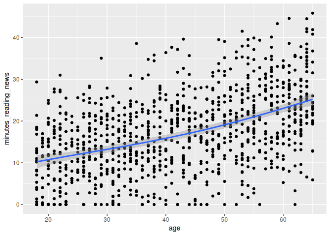
1 news_users |>
2 ggplot(aes(x = age, y = minutes_reading_news)) +
3 geom_point()
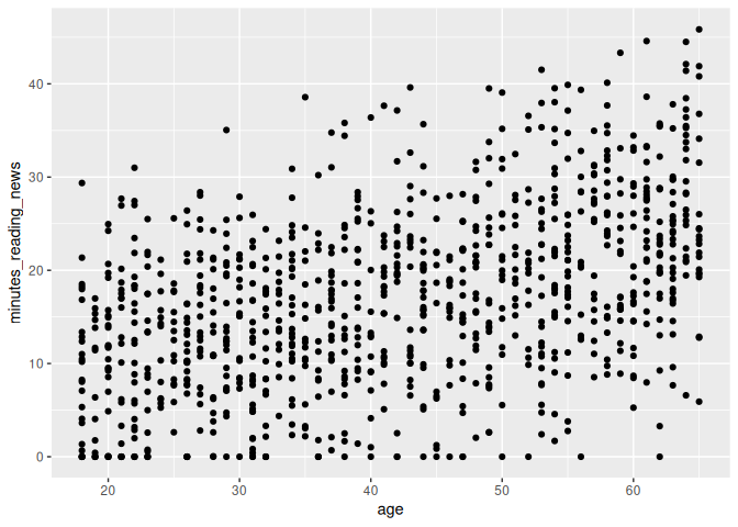
And we have a plot!
What do you think? Is there a relationship between age and the amount of time people spend reading the news? What else can we learn from this plot?
Boxplots
A second, more advanced type of plot is a boxplot. Boxplots are useful for comparing the distribution of a continuous variable across different categories. We can use the geom_boxplot() geometry to make boxplots, like so:
1 news_users |>
2 ggplot() +
3 geom_boxplot(aes(x=gender, y=minutes_reading_news))
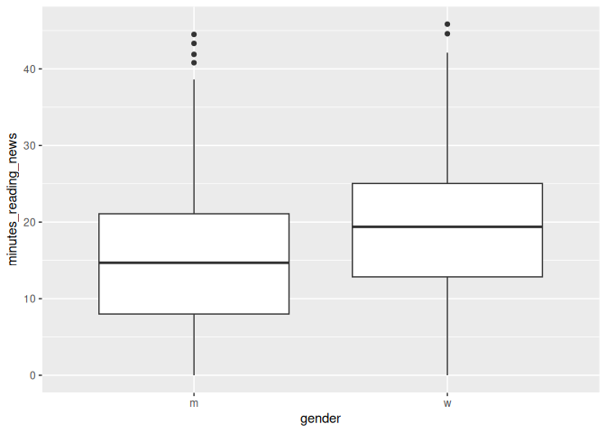
A boxplot shows the median, quartiles, and outliers of a continuous variable. Let’s take a minute to learn how to interpret these plots.
The line in the center is the median; the value that separates the top 50% of the data from the bottom 50%. The box represents the interquartile range, which is the range that contains the middle 50% of the data; from the bottom 25% to the top 25%. The whiskers extend to the most extreme data points that are not considered outliers. Outliers are shown as individual points.
What can we learn from this plot? Is there a difference in the amount of time people spend reading the news? If someone showed you this this plot in a scientific paper, would you find it convincing?
Factors vs continuous variables
Let’s now look at the first survey question. This is a categorical variable, so we can again use a boxplot to compare the distribution of the continuous variable across the different categories.
1 news_users |>
2 ggplot() +
3 geom_boxplot(aes(x=q1, y=minutes_reading_news))
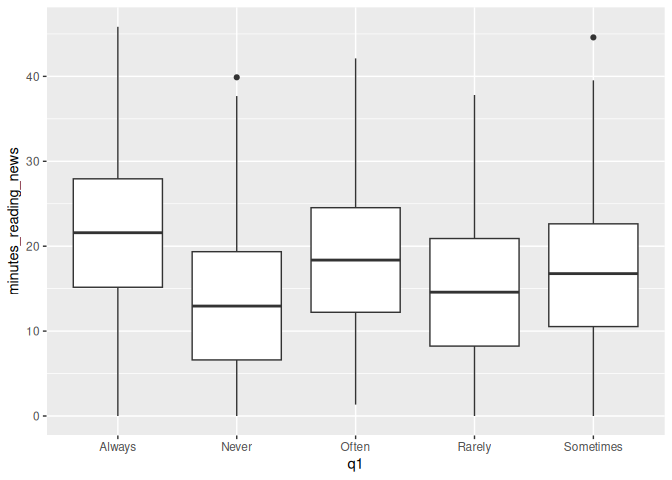
Question 1 was: “How often do you read the news?”
It looks like they were pretty honest on this question, as the boxplot shows a clear trend. However, this plot is kind of a mess: the categories are in alphabetical order, not in the order of the question. We can fix this by changing the type of the variable from a character to a factor.
What is a factor? A factor is a type of variable that has a fixed number of possible values. In this case, the possible values are “Never”, “Rarely”, “Sometimes”, “Often”, and “Always”. We can change the type of a variable using the factor() function. The levels argument specifies the order of the levels.
1 news_users |>
2 mutate(q1 = factor(q1, levels = c("Never", "Rarely", "Sometimes", "Often", "Always"))) |>
3 ggplot() +
4 geom_boxplot(aes(x=q1, y=minutes_reading_news))
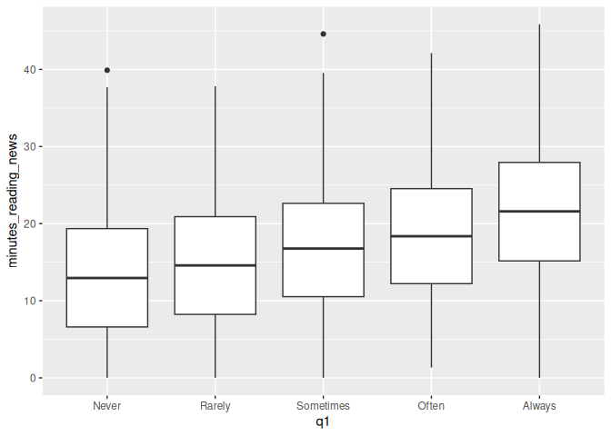
That’s much better! Now we can see them in the order we intended. Looks like a pretty clear trend to me. What more can we see from this plot?
Most of these survey questions should be considered factors. For example, in survey question 2, “Are you interested in international politics?”, we get answers on a scale of 1 to 7. This is a categorical variable, not a continuous variable. We can change it to a factor and make a boxplot to see if there is a relationship between this question and the amount of time people spend reading the news.
We can change q2 to a factor, but we don’t need to specify the levels because they are already in the correct order.
1 news_users |>
2 mutate(q2 = factor(q2)) |>
3 ggplot() +
4 geom_boxplot(aes(x=q2, y=minutes_reading_news))
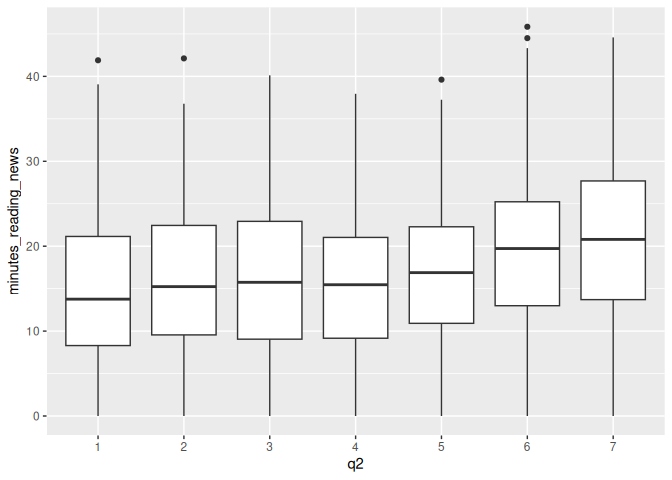
What do you think? Is there a relationship between this question and the amount of time people spend reading the news?
Density plots
Density plots are another analytic tool we have, but they can require some work to get your mind around. Imagine you had some data of different values, and you stacked them on top of each other.
You could then draw a smoothed line estimating how many data points are around each value. This is a density plot. The figure below shows stacked dots and density plots for a normal, exponential, and uniform distribution.
We can use the geom_density() geometry to make density plots, like so:
1 news_users |>
2 ggplot() +
3 geom_density(aes(x=minutes_reading_news))
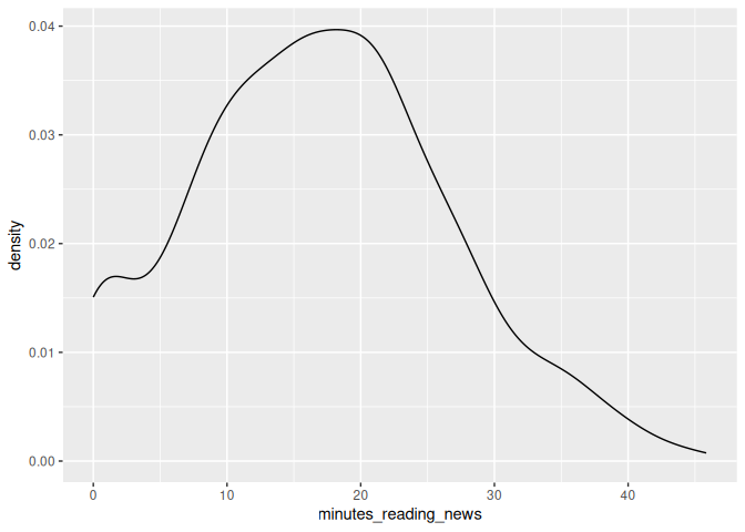
From this, we can see that there are a lot of people who hardly read any news at all, and almost none who read 30 minutes per day.
Something we can do is to add another variable to our aesthetics, color. If we assign this to another column, for example q10, we can stack plots on top of each other, with each value of q10 being a different color.
1 news_users |>
2 ggplot() +
3 geom_density(aes(x=minutes_reading_news, color=q10))
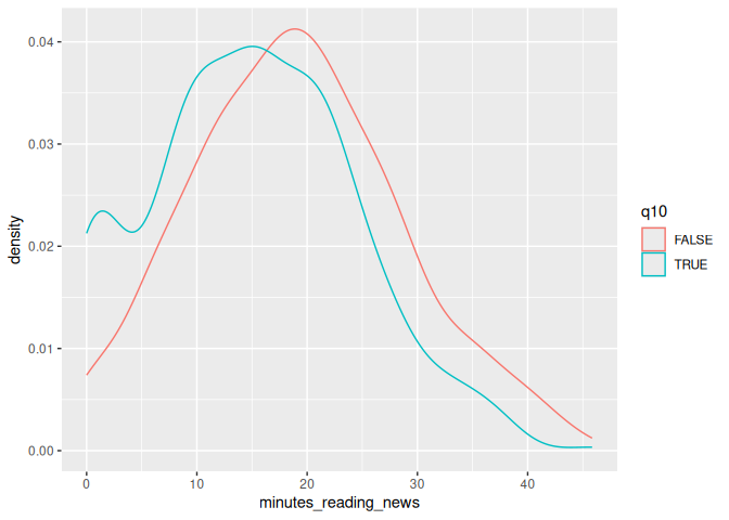
Let’s take a moment to look at this plot. Question 10 was: “Do you use Tiktok?” We can see that a lot of people who use TikTok don’t read the news at all; there’s a high density of them near 0. What else can we learn from this plot?
These are some of the first plots I go to when I get some new data, so let’s get some practice using them with our data set.
Classwork: Explore your data set
Let’s get some practice using these fundamental tools.
- Create appropriate scatterplots, boxplots, or density plots for survey questions 3-9 as you see appropriate.
- Which variables seem to have an effect on the minutes spent reading the news?
- Which variables are different from your classmates? Note that you all have different results in the ramdomly generated data set, so
you’ll have similarly different correlations.
Multiple geometries
One trick that we can use is to combine multiple geometries in the same plot. This can be useful when we want to show multiple aspects of the data at the same time. For example, we can combine a scatterplot with a smooth line to show the relationship between two variables.
Let’s go back to our age plot and add a smooth line to it using geom_smooth().
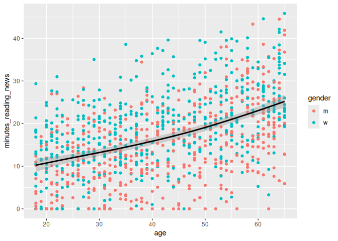
1 news_users |>
2 ggplot() +
3 geom_point(aes(x = age, y = minutes_reading_news)) +
4 geom_smooth(aes(x = age, y = minutes_reading_news))
`geom_smooth()` using method = 'gam' and formula = 'y ~ s(x, bs = "cs")'
Now we can more clearly see the relationship with a handy little line. Very cool!
Parametric vs fixed variables
Here’s something that messes people up all the time: whether to put a
variable inside the aes() function or not. These do very different
things!
If you put a variable inside the aes() parameter, ggplot will treat it
as a variable that changes across the data. For example, if you put
color=gender inside aes(), ggplot will make a different color for
men and women.
If you put a variable outside the aes() parameter, ggplot will treat
it as a fixed value. For example, if you put color="black" outside
aes(), ggplot will make all the points black. Let’s see the
difference:
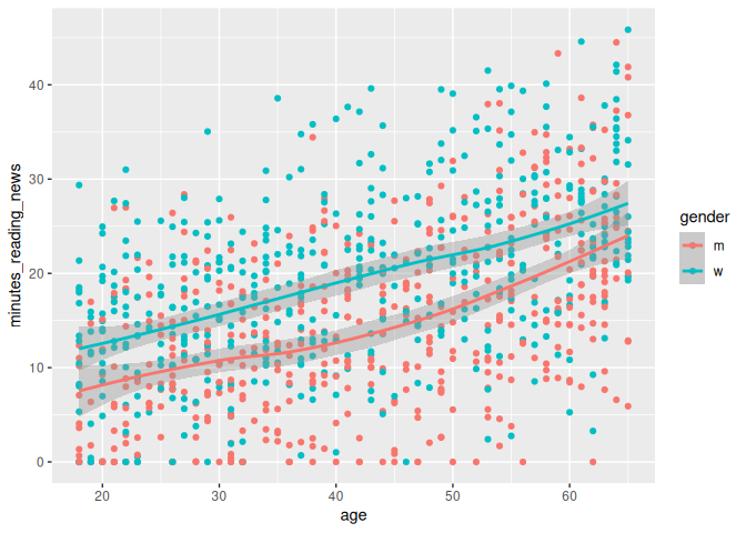
1 news_users |>
2 ggplot() +
3 geom_point(aes(x = age, y = minutes_reading_news, color=gender)) +
4 geom_smooth(aes(x = age, y = minutes_reading_news), color = "black")
`geom_smooth()` using method = 'gam' and formula = 'y ~ s(x, bs = "cs")'
Here, the color of the line is just set to black, but the color of the points depends on the gender column. We could just as easily set the line to be dependent on the gender, as so:
1 news_users |>
2 ggplot() +
3 geom_point(aes(x = age, y = minutes_reading_news, color=gender)) +
4 geom_smooth(aes(x = age, y = minutes_reading_news, color = gender))
`geom_smooth()` using method = 'loess' and formula = 'y ~ x'
Labels and titles
So, let’s say we want to finalize a plot. We can add a title, subtitle, and labels to make it more clear. We can use the labs() function to add these to a plot. Adding a title and labels are a hard requirement for any plot you make in a scientific paper.
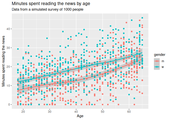
1 news_users |>
2 ggplot() +
3 geom_point(aes(x = age, y = minutes_reading_news, color=gender)) +
4 geom_smooth(aes(x = age, y = minutes_reading_news, color = gender)) +
5 labs(6 title = "Minutes spent reading the news by age",
7 subtitle = "Data from a simulated survey of 1000 people",
8 x = "Age",
9 y = "Minutes spent reading the news"
10 )`geom_smooth()` using method = 'loess' and formula = 'y ~ x'

Drawing order
One small thing: the order of the geoms matters. If you put the geom_smooth() before the geom_point(), the points will be on top of the line. If you put the geom_point() before the geom_smooth(), the line will be on top of the points. Pretty simple, but it can make a big difference in how your plot looks.
1 news_users |>
2 ggplot() +
3 geom_smooth(aes(x = age, y = minutes_reading_news, color = gender)) +
4 geom_point(aes(x = age, y = minutes_reading_news, color=gender)) +
5 labs(6 title = "Minutes spent reading the news by age",
7 subtitle = "Data from a simulated survey of 1000 people",
8 x = "Age",
9 y = "Minutes spent reading the news"
10 )`geom_smooth()` using method = 'loess' and formula = 'y ~ x'
Saving plots
Now, let’s pretend we’re happy with our plot and want to save it.
We can use the ggsave() function to save a plot; just change the file name to .png, .jpg, .pdf, .svg, or any other number of file formats. We should also specify the width, height, dpi, and units of the plot. R has a bad habit of changing things to inches, so if your plot is 2.5 times too big, check your units argument.
1 ggsave("minutes_reading_news_vs_age.pdf", width = 20, height = 15, dpi = 300, units = "cm")
Note that ggsave() will save the last plot that you made. If you want to save a different plot, you can save it as an variable and then use ggsave().
1 plot_i_want_to_save <- news_users |>
2 ggplot() +
3 geom_smooth(aes(x = age, y = minutes_reading_news, color = gender)) +
4 geom_point(aes(x = age, y = minutes_reading_news, color=gender)) +
5 labs(6 title = "Minutes spent reading the news by age",
7 subtitle = "Data from a simulated survey of 1000 people",
8 x = "Age",
9 y = "Minutes spent reading the news"
10 )11 12 ggsave("minutes_reading_news_vs_age.pdf", plot_i_want_to_save, width = 20, height = 15, dpi = 300, units = "cm")
Classwork: Finalizing plots
From your earlier classwork, save the plots that you think are the most interesting. Make sure they have titles, subtitles, and labels.
- Make your favorite plots into environmental variables using the <- operator.
- Save each plot as a .png file.
Processing data into a plot
Just like when we were cleaning data, we can use the pipe operator to process data before we make a plot. This can be useful when we want to summarize data or change the order of the levels of a factor. Here, we’ll use the group_by() and summarize() functions to calculate the mean amount of time people spend reading the news for each level of question 1.
1 news_users |>
2 group_by(q1) |>
3 summarize(mean_minutes_reading_news = mean(minutes_reading_news))
# A tibble: 5 × 2
q1        mean_minutes_reading_news
<chr>                         <dbl>
1 Always                         22.2
2 Never                          13.3
3 Often                          18.9
4 Rarely                         14.4
5 Sometimes                      16.7
We can then turn this into a bar plot using geom_col() (short for
column).
1 news_users |>
2 group_by(q1) |>
3 summarize(mean_minutes_reading_news = mean(minutes_reading_news)) |>
4 mutate(q1 = factor(q1, levels = c("Never", "Rarely", "Sometimes", "Often", "Always"))) |>
5 ggplot() +
6 geom_col(aes(x = q1, y = mean_minutes_reading_news)) +
7 labs(8 title = "Stated vs. actual time spent reading news",
9 x = "Stated news frequency on survey question\n(means, n=1000)",
10 y = "Actual time spent reading news"
11 )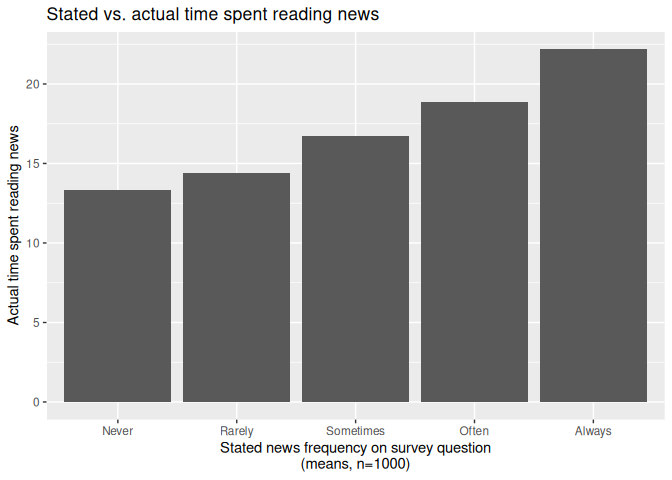
The best geoms, and some tricks for each.
GGplot has a ton of stuff to learn, and I figure out a new trick every paper I write. For more handy tips and tricks, I recommend you check out the R Graph Gallery. When you need some inspiration, this place can give you some code to copy and play around with.
Here are some of the most useful geoms, and some tricks for each.
geom_line()
Everyone likes a line plot. It’s a great way to show trends over time or across a continuous variable. We can use the geom_line() geometry to make line plots, like so:
1 news_users |>
2 group_by(age) |>
3 summarize(mean_minutes_reading_news = mean(minutes_reading_news)) |>
4 ggplot() +
5 geom_line(aes(x = age, y = mean_minutes_reading_news))
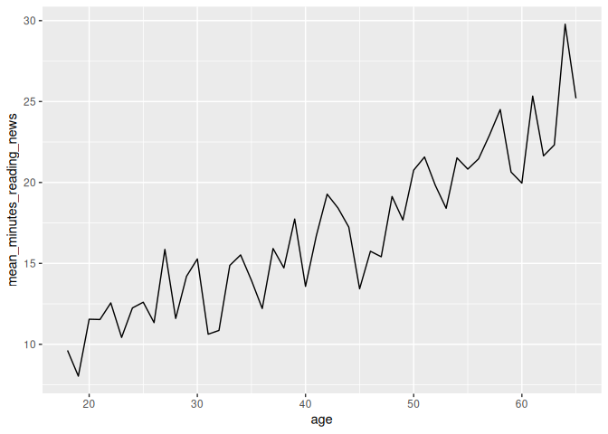
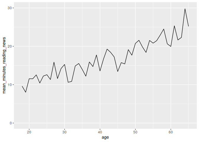
However, we can see that this plot is a bit misleading, because the Y axis doesn’t start at 0. By default, R sets the edges of your chart to wherever your data is. Sometimes, you want to make sure your chart starts and stops at a certain place, which you can do with the lims() function. X and y in lims() takes two values in a vector, the minimum and maximum values of the axis, like so:
1 news_users |>
2 group_by(age) |>
3 summarize(mean_minutes_reading_news = mean(minutes_reading_news)) |>
4 ggplot() +
5 geom_line(aes(x = age, y = mean_minutes_reading_news)) +
6 lims(y = c(0, 30))
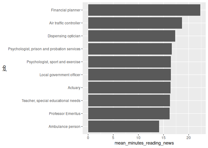
geom_col()
When someone thinks of a chart, they usually think of a bar chart. We can use the geom_col() geometry to make bar charts, like so:
1 news_users |>
2 group_by(job) |>
3 summarize(mean_minutes_reading_news = mean(minutes_reading_news)) |>
4 ggplot() +
5 geom_col(aes(x = job, y = mean_minutes_reading_news))
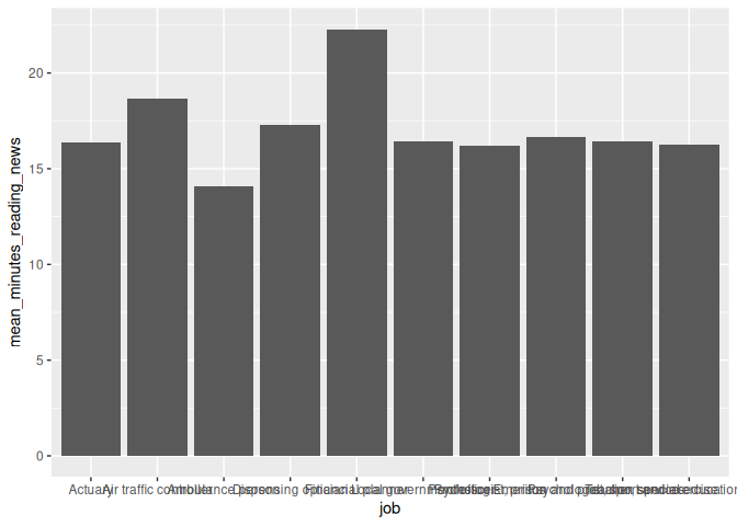
On careful inspection, we’ll see that this looks like garbage. There are a few ways to fix this, but the easiest is to just flip the chart on its side. Feel free to be creative with your charts!
1 news_users |>
2 group_by(job) |>
3 summarize(mean_minutes_reading_news = mean(minutes_reading_news)) |>
4 ggplot() +
5 geom_col(aes(y = job, x = mean_minutes_reading_news))

Second tip: Remember back to the factor() function? We can use it to order the bars in a bar chart. This can be useful when you want to show the bars in a specific order, like from smallest to largest.
here, we’ll first arrange the data by the mean amount of time people spend reading the news, and then use factor() to order the bars by this value. This “locks in” the order of the bars, so ggplot won’t change it.
1 news_users |>
2 group_by(job) |>
3 summarize(mean_minutes_reading_news = mean(minutes_reading_news)) |>
4 arrange(mean_minutes_reading_news) |>
5 mutate(job = factor(job, levels = job)) |>
6 ggplot() +
7 geom_col(aes(y = job, x = mean_minutes_reading_news))
geom_jitter(): a more random scatterplot.
I like scatterplots. They hide the least amount of data from the viewer, but they only really work if both variables are continuous. If, for example, I want to make a scatterplot of q7, which is coded on a scale from 1 to 7. A scatterplot will technically work, but isn’t fantastic.
1 news_users |>
2 ggplot() +
3 geom_point(aes(x = q7, y = minutes_reading_news))
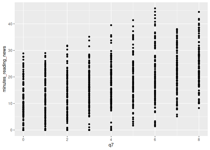
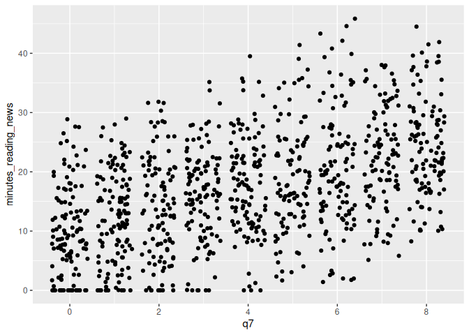
In this case, we can use geom_jitter() to add a bit of randomness to the points. This can be useful when you have a lot of data points that overlap, and you want to see them all.
1 news_users |>
2 ggplot() +
3 geom_jitter(aes(x = q7, y = minutes_reading_news))
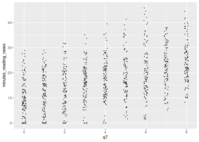
We can tweak the amount of jitter with the width argument, and maybe make the points a bit smaller with the size argument, like so:
1 news_users |>
2 ggplot() +
3 geom_jitter(aes(x = q7, y = minutes_reading_news), width = 0.1, size = 0.3)
geom_smooth()
We earlier learned about geom_smooth(), a way to add a regression line
to a plot. This can be useful when you want to show the relationship
between two variables, but don’t want to show all the data points.
However, by default, it adds a curvy line. Sometimes, we’re interested
in the straight linear relationship between two variables. We can use
the method argument to specify the type of regression line we want.
For example, we can use method = "lm" to add a linear regression line,
like so:
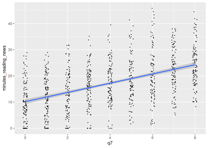
1 news_users |>
2 ggplot() +
3 geom_jitter(aes(x = q7, y = minutes_reading_news), width = 0.1, size = 0.3) +
4 geom_smooth(aes(x = q7, y = minutes_reading_news), method = "lm")
`geom_smooth()` using formula = 'y ~ x'
There’s a lot more to learn! Next week, we’ll focus on making them actually look good.
Check your knowledge
- Know the difference between a continuous, categorical, and binary variable.
- Understand the 3 basic parts of a ggplot object: data, aesthetics, and geometry.
Homework & Practice
R has some built-in data sets that are always available to you, one of
which is the mtcars data set, which describes some basic statistics
about some cars from the mid-1970s. Some explanations of the various
columns can be found
Here.
You already have the data (secretly) loaded into RStudio, and can access
it through the variable mtcars.
1 mtcars
mpg cyl  disp  hp drat    wt  qsec vs am gear carb
Mazda RX4           21.0   6 160.0 110 3.90 2.620 16.46  0  1    4    4
Mazda RX4 Wag       21.0   6 160.0 110 3.90 2.875 17.02  0  1    4    4
Datsun 710          22.8   4 108.0  93 3.85 2.320 18.61  1  1    4    1
Hornet 4 Drive      21.4   6 258.0 110 3.08 3.215 19.44  1  0    3    1
Hornet Sportabout   18.7   8 360.0 175 3.15 3.440 17.02  0  0    3    2
Valiant             18.1   6 225.0 105 2.76 3.460 20.22  1  0    3    1
Duster 360          14.3   8 360.0 245 3.21 3.570 15.84  0  0    3    4
Merc 240D           24.4   4 146.7  62 3.69 3.190 20.00  1  0    4    2
Merc 230            22.8   4 140.8  95 3.92 3.150 22.90  1  0    4    2
Merc 280            19.2   6 167.6 123 3.92 3.440 18.30  1  0    4    4
Merc 280C           17.8   6 167.6 123 3.92 3.440 18.90  1  0    4    4
Merc 450SE          16.4   8 275.8 180 3.07 4.070 17.40  0  0    3    3
Merc 450SL          17.3   8 275.8 180 3.07 3.730 17.60  0  0    3    3
Merc 450SLC         15.2   8 275.8 180 3.07 3.780 18.00  0  0    3    3
Cadillac Fleetwood  10.4   8 472.0 205 2.93 5.250 17.98  0  0    3    4
Lincoln Continental 10.4   8 460.0 215 3.00 5.424 17.82  0  0    3    4
Chrysler Imperial   14.7   8 440.0 230 3.23 5.345 17.42  0  0    3    4
Fiat 128            32.4   4  78.7  66 4.08 2.200 19.47  1  1    4    1
Honda Civic         30.4   4  75.7  52 4.93 1.615 18.52  1  1    4    2
Toyota Corolla      33.9   4  71.1  65 4.22 1.835 19.90  1  1    4    1
Toyota Corona       21.5   4 120.1  97 3.70 2.465 20.01  1  0    3    1
Dodge Challenger    15.5   8 318.0 150 2.76 3.520 16.87  0  0    3    2
AMC Javelin         15.2   8 304.0 150 3.15 3.435 17.30  0  0    3    2
Camaro Z28          13.3   8 350.0 245 3.73 3.840 15.41  0  0    3    4
Pontiac Firebird    19.2   8 400.0 175 3.08 3.845 17.05  0  0    3    2
Fiat X1-9           27.3   4  79.0  66 4.08 1.935 18.90  1  1    4    1
Porsche 914-2       26.0   4 120.3  91 4.43 2.140 16.70  0  1    5    2
Lotus Europa        30.4   4  95.1 113 3.77 1.513 16.90  1  1    5    2
Ford Pantera L      15.8   8 351.0 264 4.22 3.170 14.50  0  1    5    4
Ferrari Dino        19.7   6 145.0 175 3.62 2.770 15.50  0  1    5    6
Maserati Bora       15.0   8 301.0 335 3.54 3.570 14.60  0  1    5    8
Volvo 142E          21.4   4 121.0 109 4.11 2.780 18.60  1  1    4    2
Use this data to make 3 different plots (with 3 different geometries) showing the relationship between different car statistics. Make sure everything is properly labeled and makes sense.
Please email me the code you used to make your plots in a document named week_5_homework_(your_name).R by Tuesday, March 25th.