GGplot 2: Making it look good
Something new: R Notebooks and Quarto
1 library(readxl)
2 library(tidyverse)
We’ve been writing R scripts up until this point, but this week I want to get you started on a better way.
When you open Rstudio, you’ll notice that besides an R Script, you have a bunch of other options.
Most of these are other options are different ways to make notebooks with R code; ways to mix your code and text into a single document.
These are useful for sharing your work with others, keeping a record of your work, or publishing your work in different types of document. This textbook your reading right now is actually a collection of notebooks; I wrote the text in Rstudio, and then ran the code in the same document.
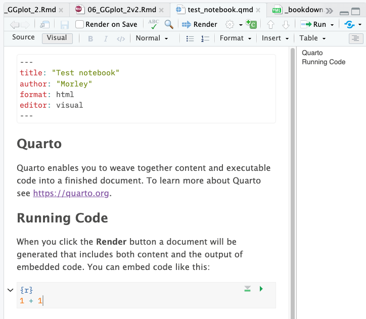
The newest of these options is Quarto, which is a polished way to make documents that mix code and text. To create a Quarto document, you can select “Quarto Document” from the “New File” menu in Rstudio.
Thinking back, we’ve learned a couple of keyboard shortcuts. We have:
Cmd-shift-Mto make a|>pipe,Cmd-Enterto run a block of code
Now, we have a third option: Cmd-shift-I to insert a new code block.
Everything outside these code blocks is text, and everything inside is
where you put your R code. Lets try it out by deleting the example code
blocks, and adding a new one at the top of your document with
Cmd-shift-I.
Making a plot
Inside the code block, let’s start by loading the Tidyverse, then in a
second code block, let’s load some data about the Bevölkerung nach
Religion, Herkunft und Statistischer
Zone.
Find the URL to the data, and load it into your document directly using
read_csv().
Usually when we’re programming, we load all of our libraries at the top of the document. This is because it’s easier to keep track of what libraries we’re using, and of someone else runs our code, they’ll know what libraries they might need to install right off the bat. Let’s keep to this convention and load the Tidyverse at the top of the document.
We then can use read_csv(), and enter a URL to load some data into our
document.
After you’ve done this, we can run an entire block of code by clicking
the green play button in the top right of the code block, or by pressing
Cmd-shift-Enter.You also have a handy little option to “Run all chunks
above”, also on the top right of the code block. This will run all the
code blocks above the one you’re currently in.
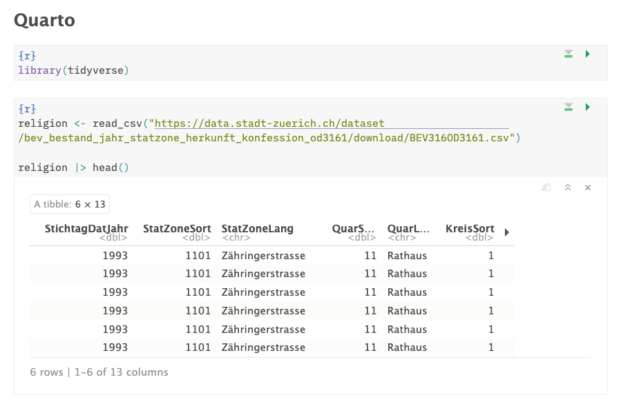
1 religion <- read_csv("https://data.stadt-zuerich.ch/dataset/bev_bestand_jahr_statzone_herkunft_konfession_od3161/download/BEV316OD3161.csv")
Let’s look at the data, and figure out what each of the columns mean:
1 religion |> glimpse()
Rows: 39,308
Columns: 13
$ StichtagDatJahr  <dbl> 1993, 1993, 1993, 1993, 1993, 1993, 1993, 1993, 1993,…
$ StatZoneSort     <dbl> 1101, 1101, 1101, 1101, 1101, 1101, 1102, 1102, 1102,…
$ StatZoneLang     <chr> "Zähringerstrasse", "Zähringerstrasse", "Zähringerstr…
$ QuarSort         <dbl> 11, 11, 11, 11, 11, 11, 11, 11, 11, 11, 11, 11, 11, 1…
$ QuarLang         <chr> "Rathaus", "Rathaus", "Rathaus", "Rathaus", "Rathaus"…
$ KreisSort        <dbl> 1, 1, 1, 1, 1, 1, 1, 1, 1, 1, 1, 1, 1, 1, 1, 1, 1, 1,…
$ HerkunftSort     <dbl> 1, 1, 1, 2, 2, 2, 1, 1, 1, 2, 2, 2, 1, 1, 1, 2, 2, 2,…
$ HerkunftCd       <dbl> 1, 1, 1, 2, 2, 2, 1, 1, 1, 2, 2, 2, 1, 1, 1, 2, 2, 2,…
$ HerkunftLang     <chr> "Schweizer*in", "Schweizer*in", "Schweizer*in", "Ausl…
$ Kon2AggSort_noDM <dbl> 1, 2, 3, 1, 2, 3, 1, 2, 3, 1, 2, 3, 1, 2, 3, 1, 2, 3,…
$ Kon2AggCd_noDM   <dbl> 1, 2, 3, 1, 2, 3, 1, 2, 3, 1, 2, 3, 1, 2, 3, 1, 2, 3,…
$ Kon2AggLang_noDM <chr> "Evangelisch-Reformiert", "Römisch-Katholisch", "Ande…
$ AnzBestWir       <dbl> 157, 122, 129, 8, 73, 95, 333, 208, 269, 14, 66, 89, …
Some of the ones that we want to look at are:
StichtagDatJahr: yearKon2AggLang_noDM: religionHerkunftLang: Swiss or foreignAnzBestWir: number of people
Let’s see how many people are in each listed religion in 2023:
1 religion |>
2 group_by(StichtagDatJahr, Kon2AggLang_noDM) |> # We want to group the data by religion and year
3 summarise(total_people = sum(AnzBestWir)) # We want to sum the number of people in each religion and year
`summarise()` has grouped output by 'StichtagDatJahr'. You can override using
the `.groups` argument.
# A tibble: 93 × 3
# Groups:   StichtagDatJahr [31]
StichtagDatJahr Kon2AggLang_noDM        total_people
<dbl> <chr>                          <dbl>
1            1993 Andere, ohne, unbekannt        97129
2            1993 Evangelisch-Reformiert        129157
3            1993 Römisch-Katholisch            134612
4            1994 Andere, ohne, unbekannt       101494
5            1994 Evangelisch-Reformiert        126379
6            1994 Römisch-Katholisch            132975
7            1995 Andere, ohne, unbekannt       105868
8            1995 Evangelisch-Reformiert        123481
9            1995 Römisch-Katholisch            131477
10            1996 Andere, ohne, unbekannt       109342
# ℹ 83 more rows
Review: Plotting some data
We can plot this pretty easily in GGplot, using a geom_col() to make a
bar graph. Do this in a new code block, and the resulting plot should be
mixed in with your code.
1 religion |>
2 group_by(StichtagDatJahr, Kon2AggLang_noDM) |>
3 summarise(total_people = sum(AnzBestWir)) |>
4 ggplot() +
5 geom_col(aes(x = StichtagDatJahr, y = total_people, fill = Kon2AggLang_noDM))
geom_col() takes a couple of useful arguments, like position, which
can be set to “dodge” to make the bars side by side, or “fill” to make
the bars fill the space.
1 religion |>
2 group_by(StichtagDatJahr, Kon2AggLang_noDM) |>
3 summarise(total_people = sum(AnzBestWir)) |>
4 ggplot() +
5 geom_col(aes(x = StichtagDatJahr, y = total_people, fill = Kon2AggLang_noDM), position = "dodge")
`summarise()` has grouped output by 'StichtagDatJahr'. You can override using
the `.groups` argument.
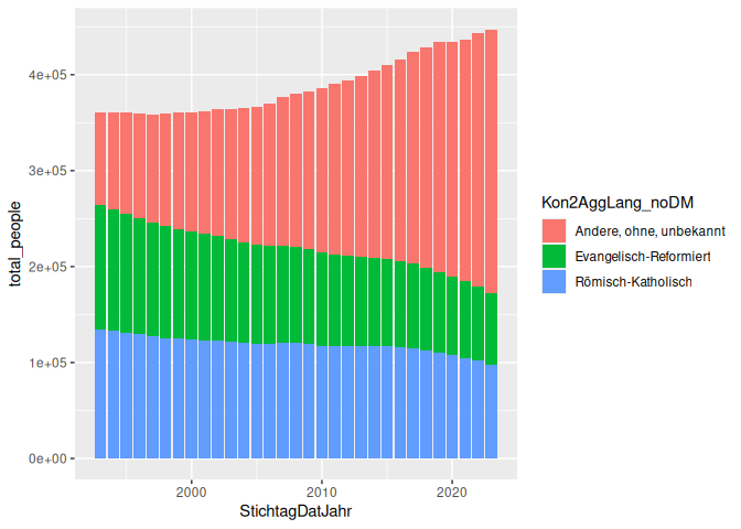
Here’s the same plot, but with position = “fill” instead of “dodge”:
1 religion |>
2 group_by(StichtagDatJahr, Kon2AggLang_noDM) |>
3 summarise(total_people = sum(AnzBestWir)) |>
4 ggplot() +
5 geom_col(aes(x = StichtagDatJahr, y = total_people, fill = Kon2AggLang_noDM), position = "fill")
`summarise()` has grouped output by 'StichtagDatJahr'. You can override using
the `.groups` argument.
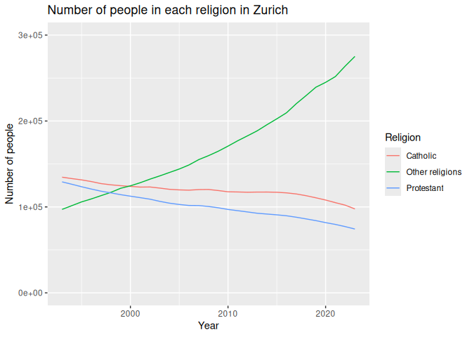
Here’s an example of a line graph, showing the number of people in each religion over time.
1 religion |>
2 group_by(StichtagDatJahr, Kon2AggLang_noDM) |>
3 summarise(total_people = sum(AnzBestWir)) |>
4 ggplot() +
5 geom_line(aes(x = StichtagDatJahr, y = total_people, color = Kon2AggLang_noDM))
Finally, we should always remember to set limits and add titles to our
graphs. This can be done using the lims() and labs() functions.
1 religion |>
2 group_by(StichtagDatJahr, Kon2AggLang_noDM) |>
3 summarise(total_people = sum(AnzBestWir)) |>
4 ggplot() +
5 geom_line(aes(x = StichtagDatJahr, y = total_people, color = Kon2AggLang_noDM)) +
6 labs(7 title = "Number of people in each religion in Zurich",
8 x = "Year",
9 y = "Number of people",
10 color = "Religion"
11 ) +
12 lims(y=c(0, 300000))
Changing row values
Often, we have to work with data sets that might not be in the right
language, have weird abbreviations or capitalization, or have other
issues. We can use the case_match() function to change these values to
something more readable.
case_match() takes a column, and a series of values to match, and then
a series of values to replace them with. This is helpful for recoding
values in a column, and is almost always used inside a mutate()
function. It has a weird syntax, like so:
1 case_match(2 column_to_change,3 "old_value_1" ~ "new_value_1",
4 "old_value_2" ~ "new_value_2",
5 "old_value_3" ~ "new_value_3"
6 )If you want to set a default value, you can use the .default argument.
This is the value that will be used if the value in the column doesn’t
match any of the values you’ve specified.
1 case_match(2 column_to_change,3 "old_value_1" ~ "new_value_1",
4 "old_value_2" ~ "new_value_2",
5 "old_value_3" ~ "new_value_3",
6 .default = "default_value"
7 )To use this in our data, we can change the religion names to English. We
use this inside a mutate() function, and then use the new column in
our plot.
1 religion |>
2 group_by(StichtagDatJahr, Kon2AggLang_noDM) |>
3 summarise(total_people = sum(AnzBestWir)) |>
4 mutate(Kon2AggLang_noDM = case_match(
5 Kon2AggLang_noDM,6 "Römisch-Katholisch" ~ "Catholic",
7 "Evangelisch-Reformiert" ~ "Protestant",
8 "Andere, ohne, unbekannt" ~ "Other religions",
9 ))
# A tibble: 93 × 3
# Groups:   StichtagDatJahr [31]
StichtagDatJahr Kon2AggLang_noDM total_people
<dbl> <chr>                   <dbl>
1            1993 Other religions         97129
2            1993 Protestant             129157
3            1993 Catholic               134612
4            1994 Other religions        101494
5            1994 Protestant             126379
6            1994 Catholic               132975
7            1995 Other religions        105868
8            1995 Protestant             123481
9            1995 Catholic               131477
10            1996 Other religions        109342
# ℹ 83 more rows
1 religion |>
2 group_by(StichtagDatJahr, Kon2AggLang_noDM) |>
3 summarise(total_people = sum(AnzBestWir)) |>
4 mutate(Kon2AggLang_noDM = case_match(
5 Kon2AggLang_noDM,6 "Römisch-Katholisch" ~ "Catholic",
7 "Evangelisch-Reformiert" ~ "Protestant",
8 "Andere, ohne, unbekannt" ~ "Other religions",
9 )) |>
12 labs(13 title = "Number of people in each religion in Zurich",
14 x = "Year",
15 y = "Number of people",
16 color = "Religion"
Classwork: Making your own
Make a graph of your choice using this data.
Here is an example you could try to copy, but make whatever you like.
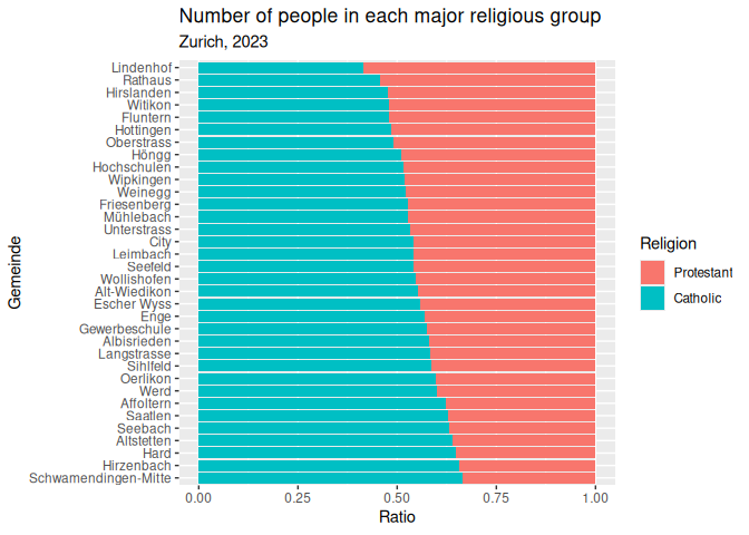
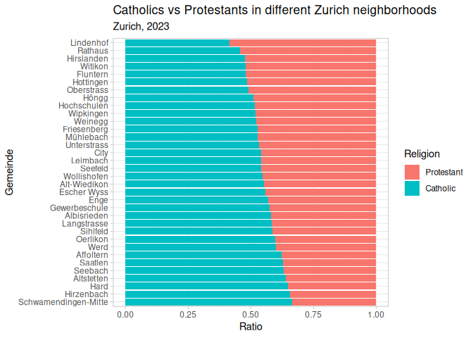
Modifying existing plots
We should always label our graphs so that people know what they’re looking at. We can do this using the labs() function. Often, we don’t want to do everything in one step, so we can save our plot as an object, and then add labels to it later.
1 plt <- # your plot code goes here.
Labels
1 plt_1 <- plt_1 +
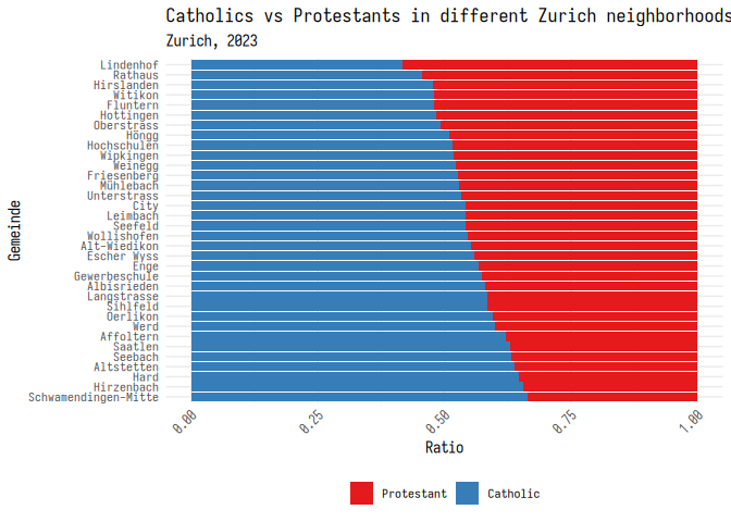
2 labs(3 title = "Catholics vs Protestants in different Zurich neighborhoods",
4 subtitle = "Zurich, 2023",
5 x = "Ratio",
6 y = "Gemeinde",
7 fill = "Religion"
8 )9 plt_1
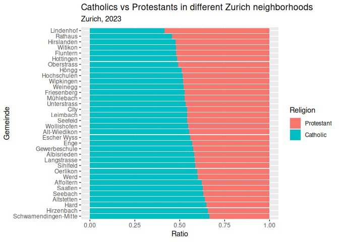
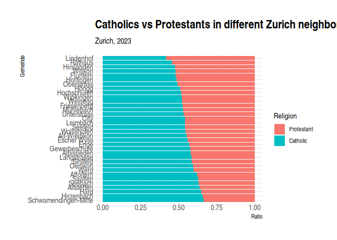
Themes
When you look at enough social science stuff, you’ll notice that a lot of the graphs look like these; using the default colors, fonts, and layouts provided by GGplot. This is fine, but we can do better. R comes with some built-in themes that you can use to make your graphs look a little more polished. Here are a couple examples:
1 plt_1 + theme_minimal()
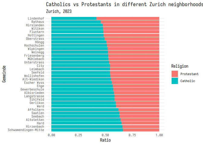
1 plt_1 + theme_light()
1 plt_1 + theme_bw()

There are also some themes that you can install from other packages. Here are a few of my favorites:
1 library(hrbrthemes)
2 plt_1 + theme_ipsum()
1 # library(ggdark)2 # plt_1 + dark_theme_gray()Changing the font
This works a little differently on everybody’s computer, but you can
also change the font of your graphs using base_family inside the
theme. Here’s an example using the Iosevka
font, one of my personal favorite
coding fonts:
You, of course, are restricted to the fonts that you have on your computer.
1 plt_1 + theme_minimal(base_family = "iosevka")
Modifying themes
You can also modify themes to make them look the way you want. Here’s an
example of how you can move the legend to the bottom of the graph, and
rotate the x-axis labels. If you want to leave out some text from your
plot, you can replace it with element_blank().
1 plt_1 + 2 theme_minimal(base_family = "iosevka") +
3 theme(4 legend.position = "bottom",
5 legend.title = element_blank(),
6 axis.text.x = element_text(angle = 45, hjust = 1)
7 )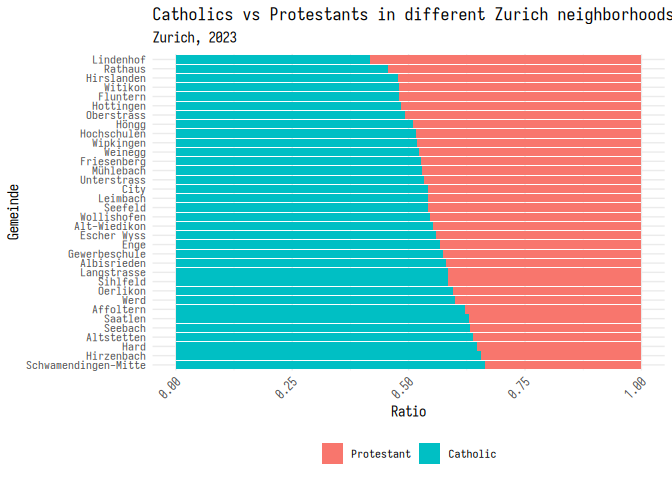
Let’s call this good, and add this to our plot object.
1 plt_1 <- plt_1 +
2 theme_minimal(base_family = "iosevka") +
3 theme(4 legend.position = "bottom",
5 legend.title = element_blank(),
6 axis.text.x = element_text(angle = 45, hjust = 1)
7 )Color schemes
In addition to changing the theme of the layout, you can also specify colors used in the plot itself. There are two ways to do this: use a pre-made color palette, or specify the colors yourself.
One option is to use the RColorBrewer package, which has a bunch of color palettes that are good for different types of data.
1 library(RColorBrewer)
2 3 plt_1 + scale_fill_brewer(palette = "Set1")
Finally, you can set your own colors using the scale_fill_manual()
function. This function takes a list of colors that you want to use in
your plot. Here’s an example of how you can set the colors to be cyan,
blue, and green. Note that you can enter colors using the name of a
color, a hex code, or as RGB values. We’ll go over this in more detail
on week 9.
1 plt_1 + scale_fill_manual(
2 values = c(
3 "#11bbbb",
4 "blue",
5 rgb(0.1, 0.8, 0.1)
6 )7 )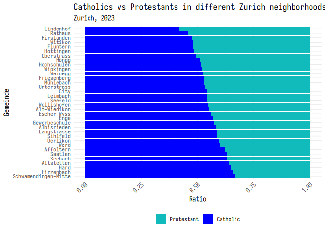
Classwork: Making stuff look good
For some practice, let’s make some charts that investigate what things might be related to traffic fatalities. This comes from the AER package, and is a data set of traffic fatalities in the US in the 1980s.
I’ve also included one data cleaning step for you; the years were coded as factors, when we probably want them as numeric values.
1 library(AER)
2 data("Fatalities")
3 4 Fatalities <- 5 Fatalities |>
6 mutate(year = as.numeric(as.character(year)))
I’ve made some basic graphs below. Your job is to make them look good, with themes and color schemes.
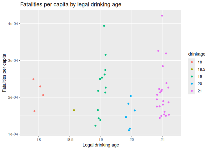
Plot 1: Traffic deaths and drinking age
1 Fatalities |>
2 filter(year == 1982) |>
3 mutate(fatalities_per_cap = fatal / pop) |>
4 mutate(drinkage = factor(drinkage)) |>
5 ggplot() +
6 geom_jitter(aes(x = drinkage, y = fatalities_per_cap, color = drinkage), width = 0.2) +
7 labs(title = "Fatalities per capita by legal drinking age", x = "Legal drinking age", y = "Fatalities per capita")
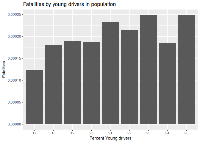
Plot 2: Traffic deaths and young drivers
1 Fatalities |>
2 filter(year == 1982) |>
3 mutate(fatalities_per_cap = fatal / pop) |>
4 mutate(young_drivers_rounded = round(youngdrivers, 2) * 100) |>
5 mutate(young_drivers_rounded = factor(young_drivers_rounded)) |>
6 group_by(young_drivers_rounded) |>
7 summarise(fatalities_per_cap = mean(fatalities_per_cap)) |>
8 ggplot() +
9 geom_col(aes(x = young_drivers_rounded, y = fatalities_per_cap)) +
10 labs(title = "Fatalities by young drivers in population", x = "Percent Young drivers", y = "Fatalities")
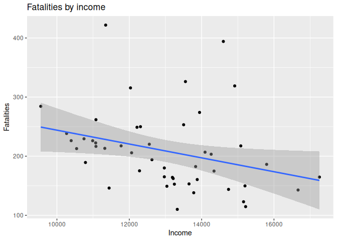
Plot 3: Traffic deaths and income
1 Fatalities |>
2 filter(year == 1982) |>
3 mutate(fatalities_per_cap = fatal / pop * 1e6) |>
4 mutate(state = toupper(state)) |>
5 ggplot(aes(x = income, y = fatalities_per_cap)) +
6 geom_point() +
7 geom_smooth(method = "lm") +
8 labs(title = "Fatalities by income", x = "Income", y = "Fatalities")
`geom_smooth()` using formula = 'y ~ x'
Discrete vs continuous scales
One last thing to note is that there’s a difference between continuous and discrete values. Continuous values are things like age, height, or weight; things that can be any number. Discrete values are things like canton or religion; things that can only be a few different values.
When you’re making a graph, you need to make sure that you’re using the
right type of scale. For continuous values, you can use
scale_color_gradient(). For discrete values, you can use
scale_color_discrete().
Color vs fill
Remember that color defines the outer edge of the shape, or the color of something with no center. Fill defines the inside of the shape, if it exists.
Each of these scales has different functions for scale and fill, for
example there is scale_fill_gradient() and scale_color_gradient().
Faceting
One last important tool is faceting. This is when you make a bunch of small graphs, each showing a different part of your data. This is useful when you have a lot of data, and you want to show how different parts of your data are related.
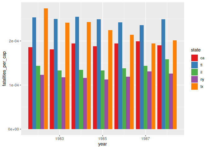
Sometimes our graph is too busy, like this example below. It’s hard to read, and you have a difficult time understanding what’s going on.
1 Fatalities |>
2 filter(state %in% c("ny", "ca", "tx", "fl", "il")) |>
3 mutate(fatalities_per_cap = fatal / pop) |>
4 ggplot() +
5 geom_col(aes(x=year, y=fatalities_per_cap, fill=state), position="dodge") +
6 scale_fill_brewer(palette = "Set1")
Instead, we can add an element to GGplot, facet_wrap(), which will
make a bunch of small graphs, each showing a different part of your
data.
1 Fatalities |>
2 filter(state %in% c("ny", "ca", "tx", "fl", "il")) |>
3 mutate(fatalities_per_cap = fatal / pop) |>
4 ggplot() +
5 geom_col(aes(x=year, y=fatalities_per_cap, fill=state), position="dodge") +
6 facet_wrap(~state) +
7 theme_minimal() +
8 scale_fill_brewer(palette = "Set1")+
9 labs(10 title = "Fatalities per capita by state",
11 x = "Year",
12 y = "Fatalities per capita"
13 ) +
14 theme(15 legend.position = "none"
16 )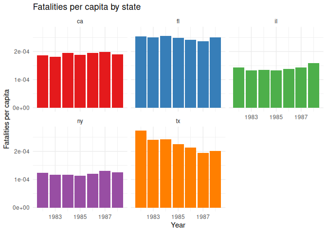
facet_wrap() has a few options that you can use to make your graphs
look better. For example, you can specify how many columns you want with
the ncol argument.
1 Fatalities |>
2 filter(state %in% c("ny", "ca", "tx", "fl", "il")) |>
3 mutate(fatalities_per_cap = fatal / pop) |>
4 mutate(year = as.numeric(as.character(year))) |>
5 ggplot() +
6 geom_col(aes(x=year, y=fatalities_per_cap, fill=state), position="dodge") +
7 facet_wrap(~state, ncol= 6) +
8 theme_minimal() +
9 scale_fill_brewer(palette = "Set1")+
10 labs(11 title = "Traffic fatalities per capita by state",
12 subtitle = "1982-1988",
13 x = "Year",
14 y = "Fatalities per capita"
15 ) +
16 theme(17 legend.position = "none"
18 )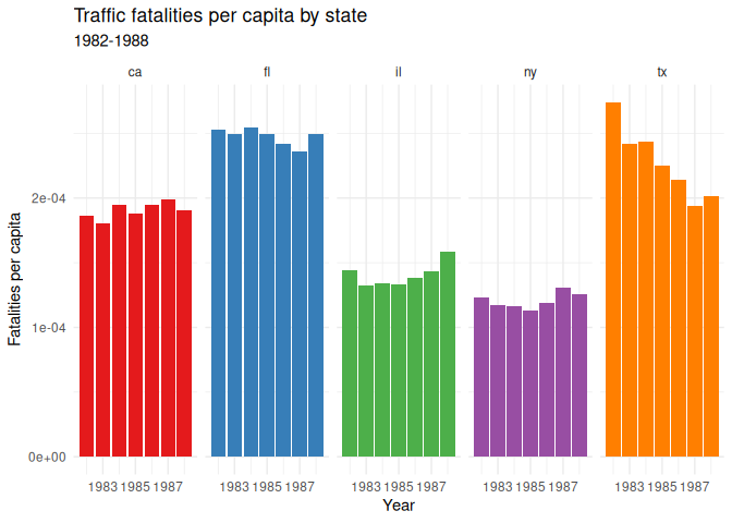
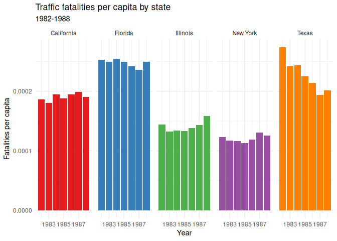
For completeness sake, I can also recode the state names to be more
readable using case_match().
1 Fatalities |>
2 filter(state %in% c("ny", "ca", "tx", "fl", "il")) |>
3 mutate(fatalities_per_cap = fatal / pop) |>
4 mutate(year = as.numeric(as.character(year))) |>
5 mutate(state = case_match(
6 state,7 "ny" ~ "New York",
8 "ca" ~ "California",
9 "tx" ~ "Texas",
10 "fl" ~ "Florida",
11 "il" ~ "Illinois",
12 )) |>
13 ggplot() +
14 geom_col(aes(x=year, y=fatalities_per_cap, fill=state), position="dodge") +
15 facet_wrap(~state, ncol= 6) +
16 theme_minimal() +
17 scale_fill_brewer(palette = "Set1")+
18 labs(19 title = "Traffic fatalities per capita by state",
20 subtitle = "1982-1988",
21 x = "Year",
22 y = "Fatalities per capita"
23 ) +
24 theme(25 legend.position = "none"
26 )
Scales
R often tries to automatically set the numbers for your x and y axes,
but sometimes it chooses something inappropriate, like scientific
notation, as above. You can force it to use a different scale using the
scale_y_continuous() function, with an argument for the type of value
you want displayed. Here’s an example of how you can force the y-axis to
use regular numbers:
1 Fatalities |>
2 filter(state %in% c("ny", "ca", "tx", "fl", "il")) |>
3 mutate(fatalities_per_cap = fatal / pop) |>
4 mutate(year = as.numeric(as.character(year))) |>
5 mutate(state = case_match(
6 state,7 "ny" ~ "New York",
8 "ca" ~ "California",
9 "tx" ~ "Texas",
10 "fl" ~ "Florida",
11 "il" ~ "Illinois",
12 )) |>
13 ggplot() +
14 geom_col(aes(x=year, y=fatalities_per_cap, fill=state), position="dodge") +
15 facet_wrap(~state, ncol= 6) +
16 theme_minimal() +
17 scale_fill_brewer(palette = "Set1")+
18 labs(19 title = "Traffic fatalities per capita by state",
20 subtitle = "1982-1988",
21 x = "Year",
22 y = "Fatalities per capita"
23 ) +
24 theme(25 legend.position = "none"
26 ) +
27 scale_y_continuous(labels = scales::number)
Homework: & Practice
This week’s homework is very open-ended. Simply find a data set that interests you, and make a plot using GGplot. Make sure to use the techniques we’ve learned in class, and make it look as good as possible.
Please email me the code you used to make your plots, as well as a saved .png of your plot in a document named week_6_homework_(your_name).R by Tuesday, April 4th. We will have a show-and-tell in class.