Aesthetics and Computer Colors
1 library(tidyverse)
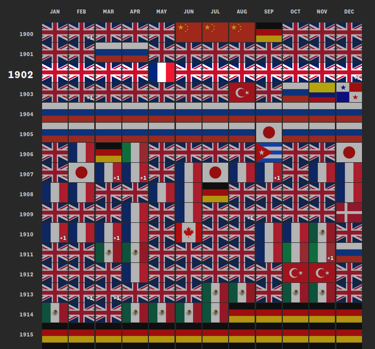
Classwork: Critiquing some data visualizations
In groups, critique the following data visualizations. For each of them, answer the following questions:
- What do you like about this data visualization?
- What do you dislike?
- Was color used effectively in this graphic?
- How long did it take for you to figure out what was going on?
- Is there another way to visualize this data?
- Do you think you would have the skills to make this graphic in R?
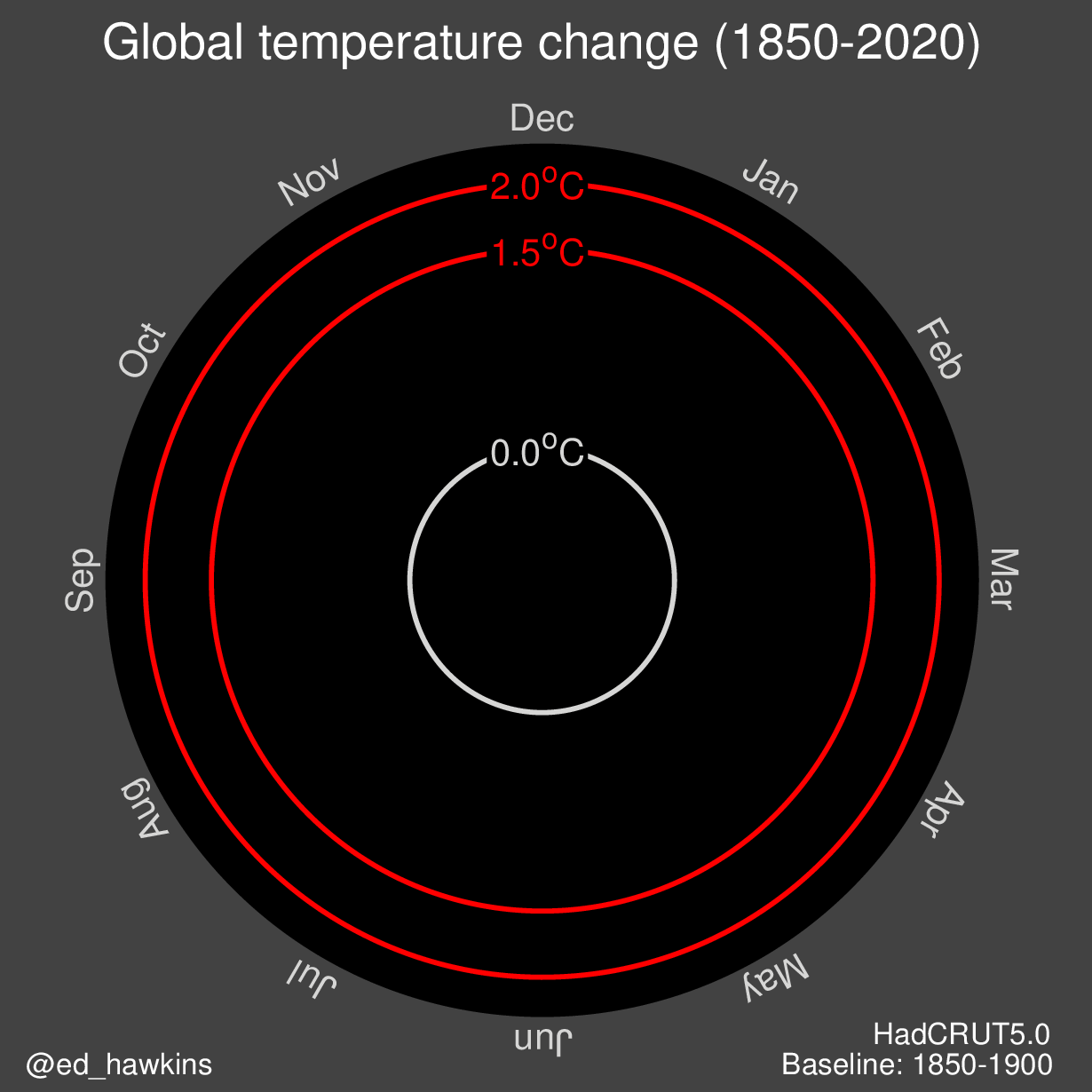
The climate tornado
This is one of many interpretations of the climate spiral, a popular way of animating climate change.
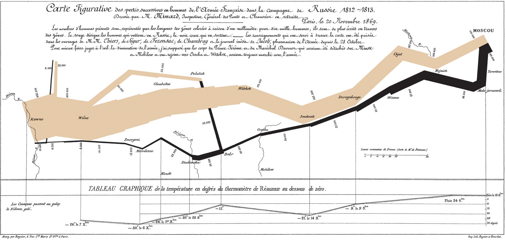
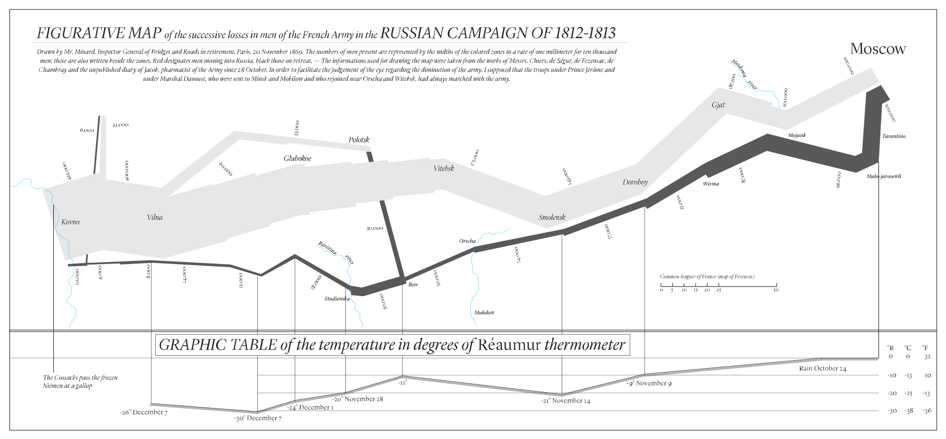
Minard’s flow chart
This chart was an early example of data visualization, showing the loss of troops during Napoleon’s march on Moscow.
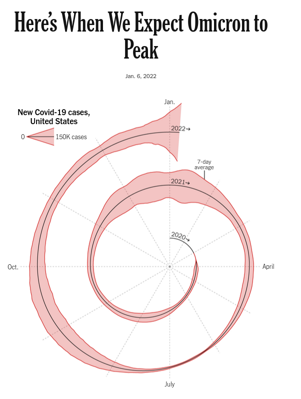
The covid spiral
This is last week’s project, now ready for your critique.
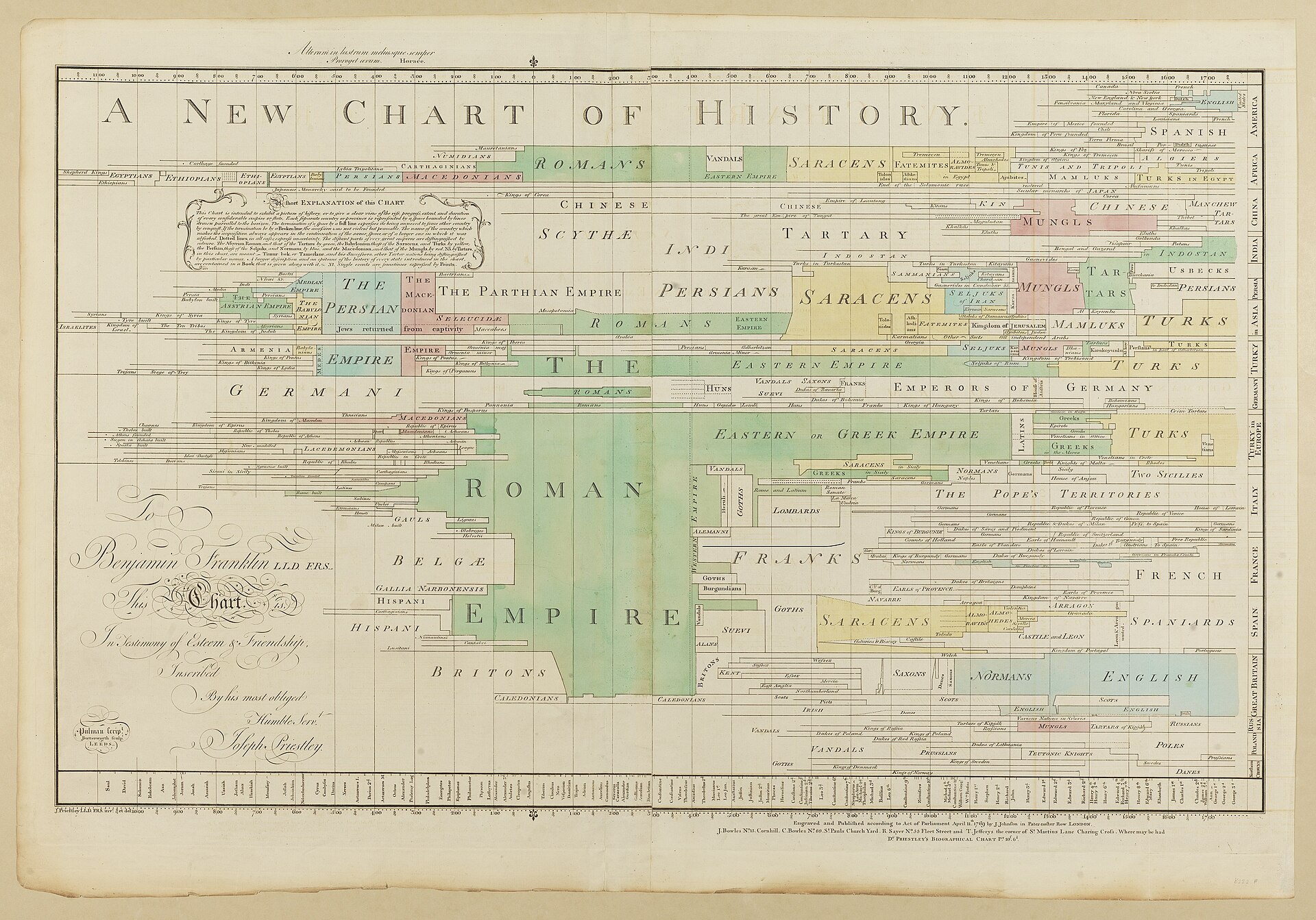
Joseph Priestly’s “A New Chart of History”
This chart is a timeline of history, showing the rise and fall of different civilizations. It was published in 1769.
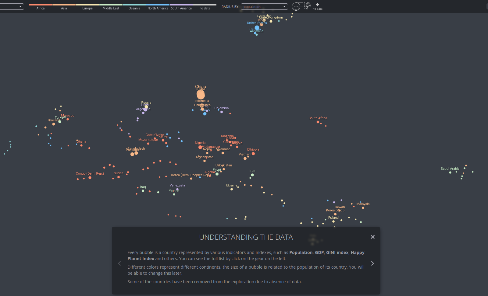
An Alternative Data-driven Country Map
An interactive clustering map of the world, showing the countries that are most similar to each other.
It can be found here, and you should view it in its original form.
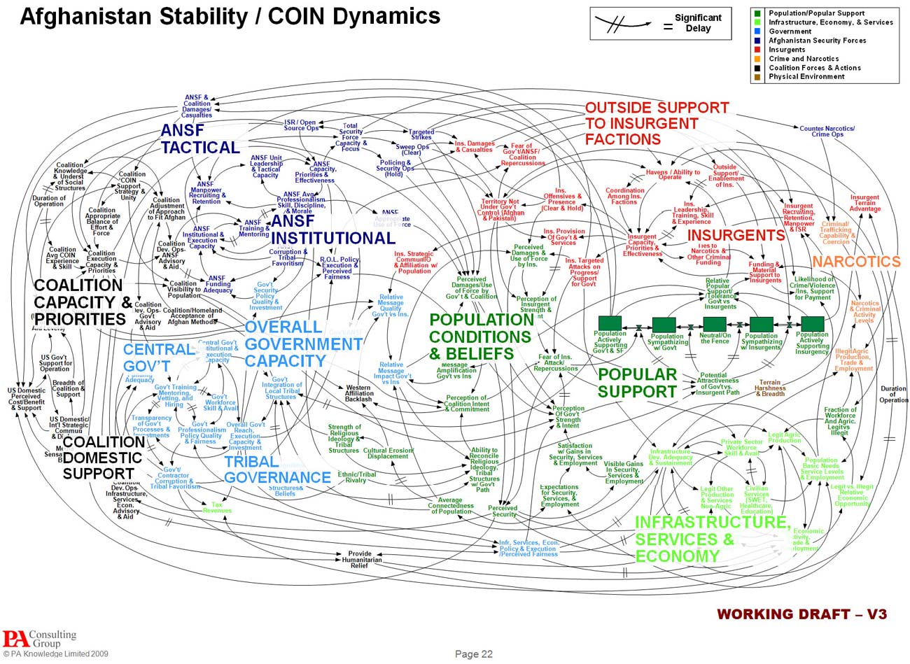
Afghan Stability / Counterinsurgency dynamics
Produced for the US military, this chart shows the interplay between different dynamics in the US-Afghan war
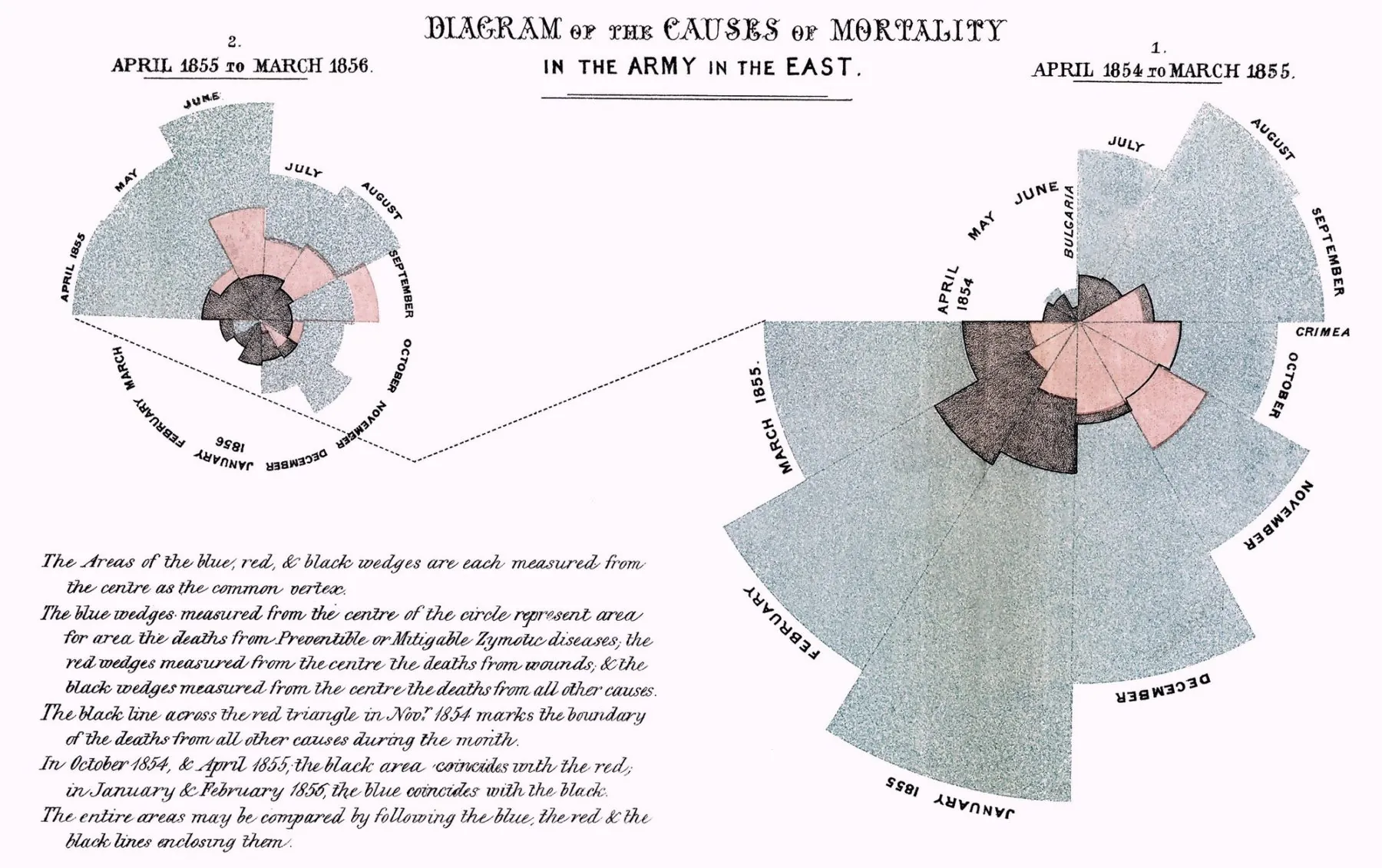
Florence Nightingale’s “Diagram of the causes of mortality in the army in the East”
This polar area chart shows the causes of death in the British army during the Crimean War.
Countries in the news
Replicating Pudding.cool’s infographic about countries in the news was my final project for a data visualization class I took in 2019.
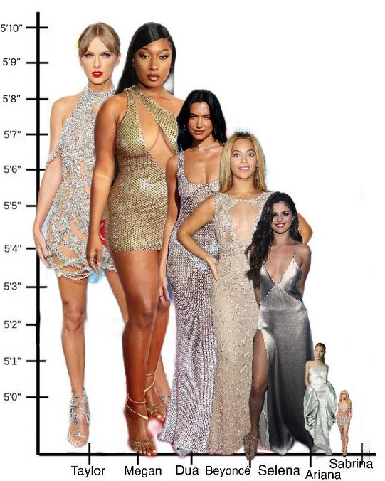
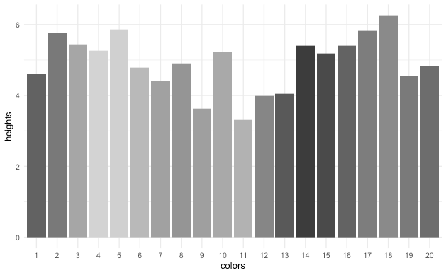
Heights of various pop stars
This chart shows the heights of some celebrities.
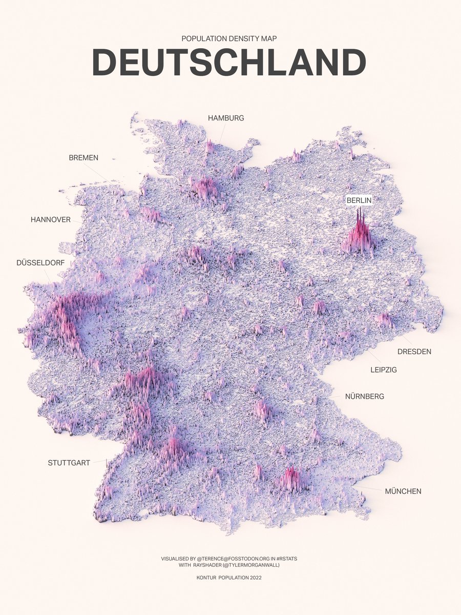
Population density of Germany
A 3d plot of the population density of Germany, done using the rayshader r package.
A few tips for making better plots
Label items on the plot
When you make a plot, it’s often better to label the items on the data itself, rather than always putting a legend on the side. This is especially true when you have a lot of data points, and the legend is too small to read. Compare the following:
Code to download and clean some data
1 library(rsdmx)
2 3 hours_worked <- readSDMX("https://sdmx.oecd.org/public/rest/data/OECD.ELS.SAE,DSD_HW@DF_AVG_USL_WK_WKD,1.0/AUS+AUT+BEL+CAN+CHL+COL+CRI+CZE+DNK+EST+FIN+FRA+DEU+GRC+HUN+ISL+IRL+ISR+ITA+KOR+LVA+LTU+LUX+MEX+NLD+NZL+NOR+POL+PRT+SVK+SVN+ESP+SWE+CHE+TUR+GBR+USA..._T+F+M._T....ICSE93_1.FT...?startPeriod=1979&dimensionAtObservation=AllDimensions")
4 5 hours_worked <- hours_worked |>
6 as_tibble()
7 8 hours_worked <- hours_worked |>
9 select(TIME_PERIOD, REF_AREA, SEX, obsValue) |>
10 rename(11 year = TIME_PERIOD,
12 country = REF_AREA,
13 gender = SEX,
14 hours_worked = obsValue15 ) |>
16 mutate(17 year = as.numeric(year),
18 hours_worked = as.numeric(hours_worked)
19 )20 21 hours_worked |>
22 write_csv("input_data/hours_worked.csv")
Plotting code: bad plot
1 hours_worked <- read_csv("input_data/hours_worked.csv")
2 3 hours_worked |>
4 filter(country %in% c("USA", "MEX", "NZL", "DEU", "SWE")) |>
5 filter(year == 2010) |>
6 filter(gender == "_T") |>
7 mutate(country = case_match(country,
8 "DEU" ~ "Germany",
9 "SWE" ~ "Sweden",
10 "USA" ~ "United States",
11 "MEX" ~ "Mexico",
12 "NZL" ~ "New Zealand"
13 )) |>
14 ggplot() +
15 geom_col(aes(x = country, y = hours_worked, fill = country)) +
16 theme_minimal() +
17 theme(18 axis.text.x = element_blank(),
19 axis.ticks.x = element_blank(),
20 axis.title.x = element_blank()
21 ) +
22 labs(23 title = "Average weekly hours worked per person",
24 x = "Country",
25 y = "Hours worked"
26 )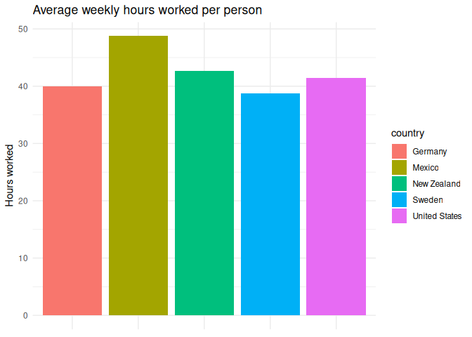
Plotting code: slightly better plot
1 hours_worked |>
2 filter(country %in% c("USA", "MEX", "NZL", "DEU", "SWE")) |>
3 filter(year == 2010) |>
4 filter(gender == "_T") |>
5 mutate(country = case_match(country,
6 "DEU" ~ "Germany",
7 "SWE" ~ "Sweden",
8 "USA" ~ "United States",
9 "MEX" ~ "Mexico",
10 "NZL" ~ "New Zealand"
11 )) |>
12 ggplot() +
13 geom_col(aes(x = country, y = hours_worked, group = country), fill = "#222222") +
14 geom_text(15 aes(x = country,
16 y = hours_worked,
17 label = hours_worked18 ),
19 vjust = -0.5,
20 size = 3
21 ) +
22 theme_minimal() +
23 theme(24 legend.position = "none",
25 axis.title.x = element_blank(),
26 panel.grid = element_blank()
27 ) +
28 labs(29 title = "Average weekly hours worked per person",
30 x = "Country",
31 y = "Hours worked"
32 )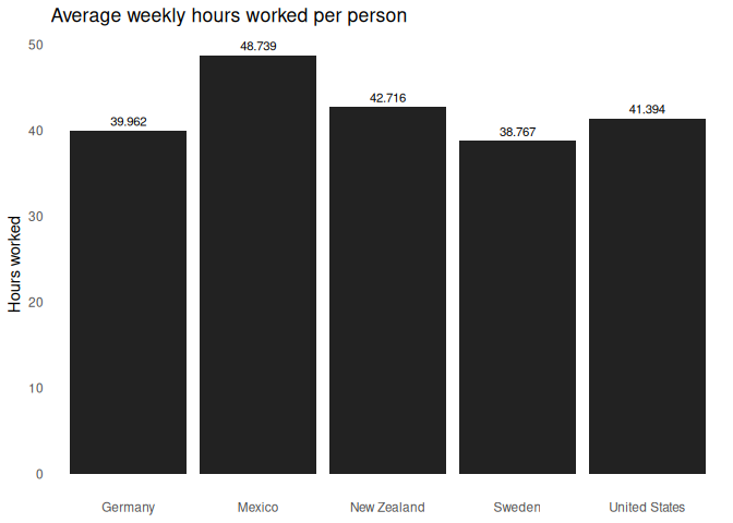
While the former plot is colorful, it also requires a lot more work to read. Sometimes simpler is better.
Don’t use color if you don’t have to.
Often, we’ll find ourselves making things colorful just because we can, not worrying about whether it adds anything to the plot. In many cases, you could accomplish the same task better by faceting the plot, adding labels, or using different shapes or line types. Only resort to colors if you have to.
In academia, this is especially pertinent, as academic journals will often charge you extra if you include color figures in your article. If you can make the same plot in black and white, you should.
Using multiple indicators for a data point with `linetype =` and `shape =`
When you have a lot of data points and have ot use a legend, it’s often useful to use multiple indicators to show the data. For example, you can use color and shape to show two different variables at once. While the color can be helpful to most, having a shape or line type can help the rest.
You can specify this with linetype = (for line-based geometries) and
shape = (for points) in the aes() function.
Plotting code: multiple line types
1 hours_worked |>
2 filter(country %in% c("USA", "MEX", "SWE")) |>
3 filter(gender != "_T") |>
4 mutate(country = case_match(country,
5 "USA" ~ "United States",
6 "SWE" ~ "Sweden",
7 "MEX" ~ "Mexico",
8 )) |>
9 mutate(10 gender = case_match(
11 gender,12 "M" ~ "Men",
13 "F" ~ "Women"
14 )15 ) |>
16 ggplot(aes(x = year, y = hours_worked, color = country)) +
17 geom_line(18 aes(19 linetype = country,
20 ),
21 linewidth = 1
22 ) +
23 facet_wrap(~gender) +
24 labs(25 title = "Average weekly hours worked per person",
26 x = "Year",
27 y = "Hours worked",
28 color = "Country",
29 linetype = "Country"
30 ) +
31 theme_minimal()
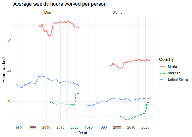
Note that this doesn’t really work if you have more than a few categories.
Plotting code: too many line types
1 hours_worked |>
2 filter(country %in% c("USA", "MEX", "SWE", "NZL", "DEU", "GRC")) |>
3 filter(gender != "_T") |>
4 mutate(country = case_match(country,
5 "USA" ~ "United States",
6 "NZL" ~ "New Zealand",
7 "SWE" ~ "Sweden",
8 "MEX" ~ "Mexico",
9 "DEU" ~ "Germany",
10 "GRC" ~ "Greece",
11 )) |>
12 mutate(13 gender = case_match(
14 gender,15 "M" ~ "Men",
16 "F" ~ "Women"
17 )18 ) |>
19 ggplot(aes(x = year, y = hours_worked, color = country)) +
20 geom_line(21 aes(22 linetype = country,
23 ),
24 linewidth = 1
25 ) +
26 facet_wrap(~gender) +
27 labs(28 title = "Average weekly hours worked per person",
29 x = "Year",
30 y = "Hours worked",
31 color = "Country",
32 linetype = "Country"
33 ) +
34 theme_minimal()
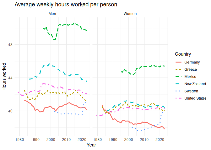
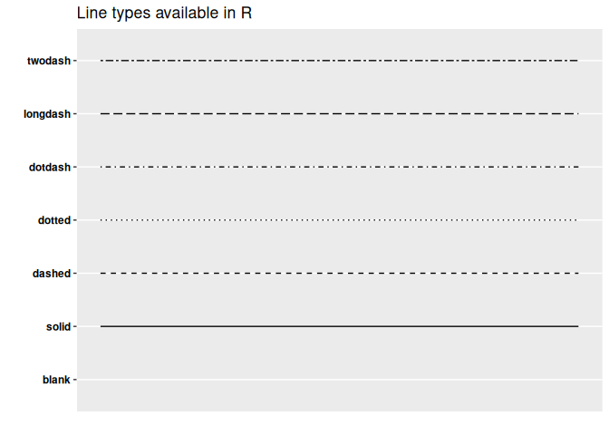
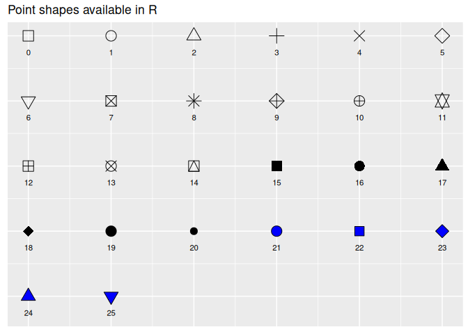
GGplot will automatically assign different line types or shapes to each
category, but I sure wouldn’t want to differentiate between all of them.
They each have a code assigned to them, which you can set manually using
scale_shape_manual(). You can see the codes for each shape by running
the following code:
Scale for y is already present.
Adding another scale for y, which will replace the existing scale.
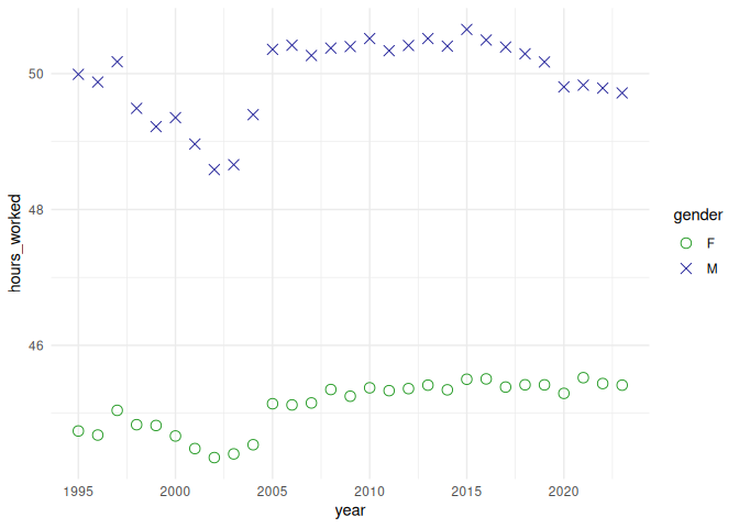
1 hours_worked |>
2 filter(gender != "_T") |>
3 filter(country == "MEX") |>
4 ggplot(aes(x = year, y = hours_worked)) +
5 geom_point(aes(shape = gender, color = gender), size = 3) +
6 scale_shape_manual(values = c(1, 4)) +
7 scale_color_manual(values = c("#229922", "#222299")) +
8 theme_minimal()
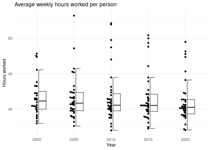
Use multiple geometries to visualize the data
While the main gist of this section is to keep it simple, there are times when you can use multiple geometries to show the data. For example, you can use a boxplot to show the distribution of the data, and then add points to show the actual data points. This can show the distribution of the data in multiple ways, which can prevent you from accidentally hiding some subtleties in the data.
Plotting code
1 library(gghalves)
2 library(ggbeeswarm)
3 4 hours_worked |>
5 filter(year %in% c(2000, 2005, 2010, 2015, 2020)) |>
6 filter(hours_worked != 0) |>
7 mutate(year = as.factor(year)) |>
8 filter(gender == "_T") |>
9 ggplot() +
10 geom_beeswarm(11 aes(x = year, y = hours_worked),
12 fill = "#222222",
13 side = -1,
14 size = 1.5,
15 ) +
16 geom_half_boxplot(17 aes(x = year, y = hours_worked),
18 side = "r",
19 alpha = 0.5,
20 outlier.shape = NA,
21 width = 0.5,
22 nudge = 0.05,
23 ) +
24 labs(25 title = "Average weekly hours worked per person",
26 x = "Year",
27 y = "Hours worked"
28 ) +
29 theme_minimal()
Classwork: Color blindness and accessibility
- Everyone should find a data visualization online, save it to a file, and paste it into this website:
<https://www.color-blindness.com/coblis-color-blindness-simulator/>
- This will show you what your plot looks like to someone with color blindness. Do the colors still work? If not, what could you do to
make them more accessible?
Printability
Especially when you’re making plots for an academic article, you need to make sure that they look good in black and white, because many people still print things off to read them on their B&W office printer, and your plot should still look OK. You can use the color blindness simulator to see how your plot looks in black and white under the monochromacy setting, or actually print it off before publishing.
Be careful with gradients, as they can do weird things in black and white. For example, this chart looks pretty festive and easy to interpret in color, but in black and white, it’s a mess.
Viridis: an example of a good color palette
1 library(viridis)
One of the best color palettes available is the Viridis color palettes, a collection of color gradients built into GGplot and Python’s matplotlib.
The introduction page on CRAN has a thorough introduction, but it is colorblind and printer friendly, beautiful, and a good default choice.
However, it is everyone’s default choice, and now that you’ve seen it, you’ll start noticing it everywhere. If you want to stand out a bit, it’s best to be able to make your own.
Computer colors
To do this effectively, let’s go on a little deep dive into how colors are represented on computers.
Old-school graphics
Everything on a computer is stored as groups of 0s and 1s. This is called the binary number system. Back in the olden days, computers would display colors as only black and white, with a 0 being black and a 1 being white (or green, or whatever color the screen was).
1 tibble(2 g = c(0, 0, 0, 0, 0, 0, 0),
3 f = c(0, 0, 1, 0, 1, 0, 0),
4 e = c(0, 0, 0, 0, 0, 0, 0),
5 d = c(0, 0, 0, 1, 0, 0, 0),
6 c = c(0, 1, 0, 0, 0, 1, 0),
7 b = c(0, 0, 1, 1, 1, 0, 0),
8 a = c(0, 0, 0, 0, 0, 0, 0)
9 ) |>
10 mutate(row = row_number()) |>
11 pivot_longer(cols = a:g, names_to = "column", values_to = "value") |>
12 ggplot() +
13 geom_tile(aes(x = row, y = column, fill = value)) +
14 scale_fill_gradient(low = "#112222", high = "#22dd22") +
15 theme_void() +
16 theme(legend.position = "none")

This was fine in the 1980s, but as computers got more powerful, people wanted to display more colors. To do this, we need to understand how computers store numbers.
When we write a number, we can go from 0 to 9 before we need to add another digit. This is called base 10, because we have 10 digits to work with. Computers, however, only have two digits: 0 and 1. This is called base 2, or binary. When numbers are stored in a computer, you need to add another digit every time you get to 2.
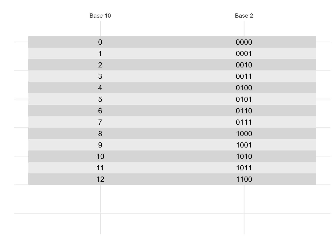
Classwork: Counting in binary
Without peeking, on a piece of paper, write the numbers 1 to 20 in binary.
- How many bits (a 0 or a 1) do you need to write the number 20 in binary?
- What is 1111 in base 10?
- How many different numbers can you write with 4 bits?
Four-bit color
The next innovation was to code each of these numbers to a color. This is called a color palette. Here’s a four-bit color palette:
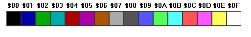
Note that with 4 bits, we get 16 colors. This is because 2^4 = 16. To make it easier to remember, we can write these numbers in hexadecimal, which is base 16. This is why the colors are written as #0, #1, #2, …, #9, #A, #B, #C, #D, #E, #F. Hexidecimal is used all the time in computer programming because it’s a nice way to write numbers in base 16.
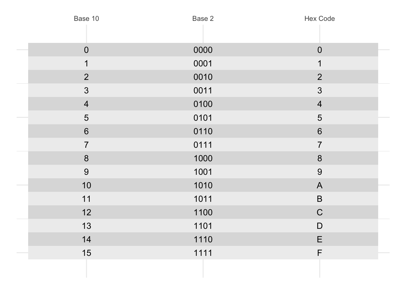
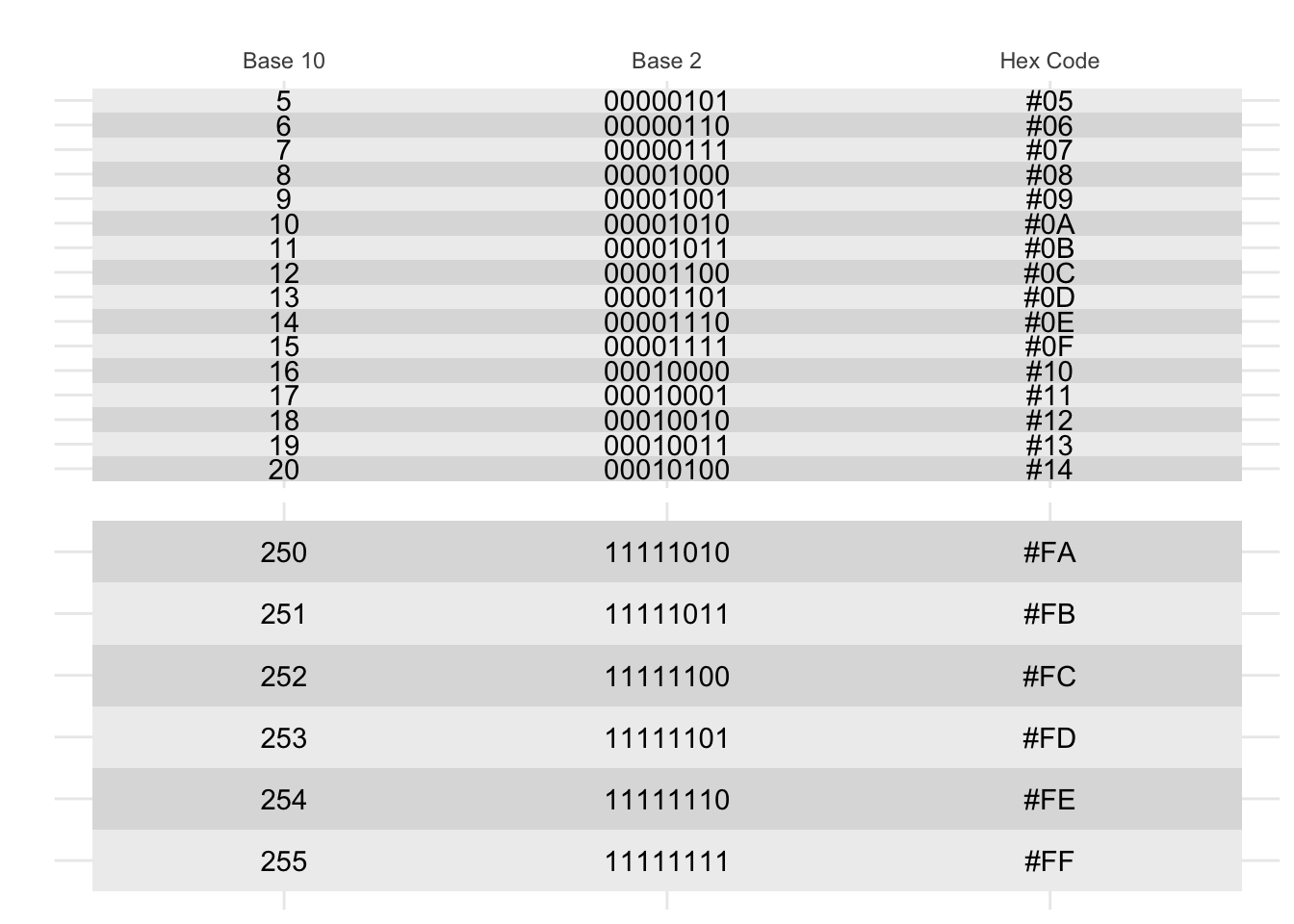
But what if you want more than 16 numbers? You could use 8 bits, which gives you 256 colors. This is called the 8-bit color model. This is often represented with two hexidecimal digits, so you can have colors like #00, #01, …, #FF.
Color channels
Color palettes were fine for the early 90s, but there were two problems:
- The colors were different on every computer.
- There were only a limited number of colors.
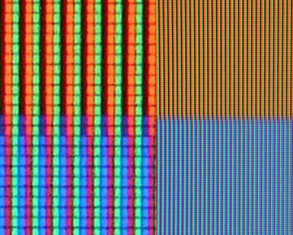
We solved this by using three color channels: red, green, and blue.This is called the RGB color model. This works well, because if you look super closely at most compuuter screens, you’ll see that it’s made up of tiny red, green, and blue dots right next to each other, and your brain mixes them together to make all the colors you see.
Web colors
The current most common color model is the web color model, which uses 8 bits for each color channel; two hexidecimal digits for each color. For this, there are two digits for red, two for green, and two for blue. This means that there are 256 different values for each color channel, which gives us 256 * 256 * 256 = 16,777,216 different colors.
In this system, the color #000000 is black, #FFFFFF is white, #FF0000 is red, #00FF00 is green, and #0000FF is blue. R + G + B.
Here is a color wheel of all the colors in the web color model:
1 tibble(2 hue = seq(0,1, length.out = 13),
3 color = hsv(hue, 1, 1)
4 ) |>
5 mutate(color_string = color |> as.character()) |>
6 head(-1) |>
7 ggplot(aes(x = hue, y = 1)) +
8 geom_tile(aes(fill = color)) +
9 geom_text(aes(label = color_string), color = "black") +
10 scale_fill_identity() +
11 lims(y = c(-0.5, 1.5)) +
12 theme_void() +
13 coord_polar()
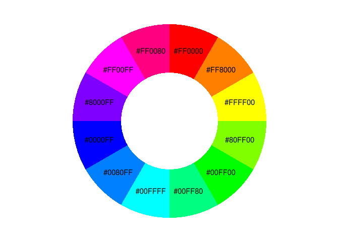
You’ll notice that this color wheel is a little different than the one you learned in school; the complement of blue is yellow, not orange. This is because this is a color wheel of light, not pigment. The primary colors of light are red, green, and blue, not red, yellow, and blue.

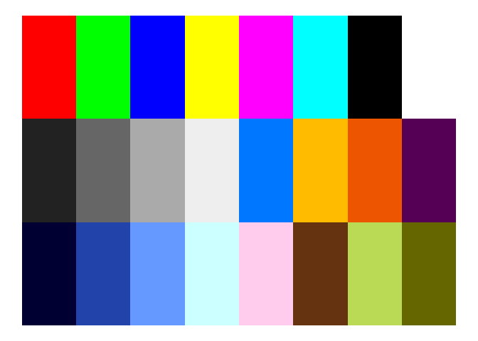
Classwork: Color matching
Let’s get some practice with color matching. I’ve given you an array of tiles, each with a different color. Please type the hex code that matches each color. You don’t have to be exact.
Do as many as you can in 15 minutes.
1 ggplot() +
2 geom_tile(aes(x = 1, y = 0), fill = "#ff0000") +
3 geom_tile(aes(x = 2, y = 0), fill = "#00ff00") +
4 geom_tile(aes(x = 3, y = 0), fill = "#000000") +
5 geom_tile(aes(x = 4, y = 0), fill = "#000000") +
6 geom_tile(aes(x = 5, y = 0), fill = "#000000") +
7 geom_tile(aes(x = 6, y = 0), fill = "#000000") +
8 geom_tile(aes(x = 7, y = 0), fill = "#000000") +
9 geom_tile(aes(x = 8, y = 0), fill = "#000000") +
10 geom_tile(aes(x = 1, y = 1), fill = "#000000") + # Second row starts here
11 geom_tile(aes(x = 2, y = 1), fill = "#000000") +
12 geom_tile(aes(x = 3, y = 1), fill = "#000000") +
13 geom_tile(aes(x = 4, y = 1), fill = "#000000") +
14 geom_tile(aes(x = 5, y = 1), fill = "#000000") +
15 geom_tile(aes(x = 6, y = 1), fill = "#000000") +
16 geom_tile(aes(x = 7, y = 1), fill = "#000000") +
17 geom_tile(aes(x = 8, y = 1), fill = "#000000") +
18 geom_tile(aes(x = 1, y = 2), fill = "#000000") + # Third row starts here
19 geom_tile(aes(x = 2, y = 2), fill = "#000000") +
20 geom_tile(aes(x = 3, y = 2), fill = "#000000") +
21 geom_tile(aes(x = 4, y = 2), fill = "#000000") +
22 geom_tile(aes(x = 5, y = 2), fill = "#000000") +
23 geom_tile(aes(x = 6, y = 2), fill = "#000000") +
24 geom_tile(aes(x = 7, y = 2), fill = "#000000") +
25 geom_tile(aes(x = 8, y = 2), fill = "#000000") +
26 theme_void() +
27 lims(y=c(2.5, -0.5))

There you go! This is a skill you have for the rest of your life.
Homework
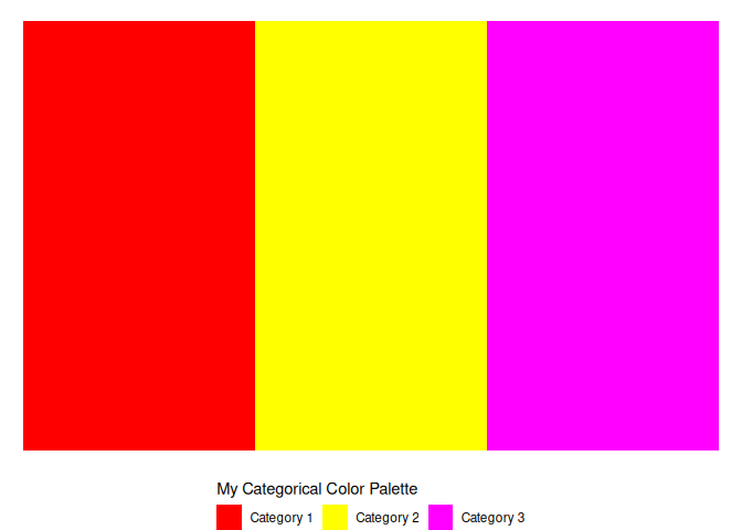
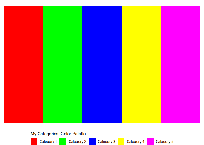
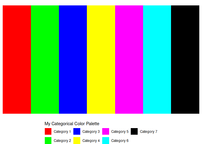
Homework 1: 3 categorical color palettes
For your first assignment, you’ll make three categorical color palettes: One for 3 colors, one for 5 colors, and one for 7 colors. You can use any colors you like, but make sure they are distinct and easy to tell apart. Check that they are accessible to colorblind people, and could be printed out and read without too much trouble.
You can use the templates below to get started.
1 tibble(categories = 1:3) |>
2 mutate(categories = as.character(categories)) |>
3 mutate(categories = paste("Category", categories)) |>
4 ggplot() +
5 geom_tile(aes(x = categories, y = 1, fill = categories)) +
6 theme_void() +
7 theme(legend.position = "bottom") +
8 labs(fill = "My Categorical Color Palette") +
9 guides(fill = guide_legend(title.position="top")) +
10 scale_fill_manual(11 values = c(
12 "#ff0000",
13 "#ffff00",
14 "#ff00ff")
15 ) # Change this!
1 tibble(categories = 1:5) |>
2 mutate(categories = as.character(categories)) |>
3 mutate(categories = paste("Category", categories)) |>
4 ggplot() +
5 geom_tile(aes(x = categories, y = 1, fill = categories)) +
6 theme_void() +
7 theme(legend.position = "bottom") +
8 labs(fill = "My Categorical Color Palette") +
9 guides(fill = guide_legend(title.position="top")) +
10 scale_fill_manual(11 values = c(
12 "#ff0000",
13 "#00ff00",
14 "#0000ff",
15 "#ffff00",
16 "#ff00ff")
17 ) # Change this!
1 tibble(categories = 1:7) |>
2 mutate(categories = as.character(categories)) |>
3 mutate(categories = paste("Category", categories)) |>
4 ggplot() +
5 geom_tile(aes(x = categories, y = 1, fill = categories)) +
6 theme_void() +
7 theme(legend.position = "bottom") +
8 labs(fill = "My Categorical Color Palette") +
9 guides(fill = guide_legend(title.position="top")) +
10 scale_fill_manual(11 values = c(
12 "#ff0000",
13 "#00ff00",
14 "#0000ff",
15 "#ffff00",
16 "#ff00ff",
17 "#00ffff",
18 "#000000"19 )20 ) # Change this!
Homework 2: 3 continuous color palettes.
The other type of color palette is a continuous color palette, where the color changes gradually with the value of the variable.
You can test this out by making a gradient with the code below. Here’s a
simple example of a gradient with some nice blues, using the
scale_fill_gradientn() function.
Make 3 gradients of your own, so that you can use them in future plots whenever you wish.
1 tibble(2 grad = 0:20 / 20,
3 ) |>
4 ggplot() +
5 geom_tile(aes(x = grad, y = 1, fill = grad)) +
6 theme_void() +
7 theme(legend.position = "bottom") +
8 labs(fill = "My categorical color palette") +
9 guides(fill = guide_colorbar(title.position="top")) +
10 scale_fill_gradientn(colors = c(
11 "#222255",
12 "#227788",
13 "#88bbff") # Change these! Add as many colors to the middle as you like.
14 ) 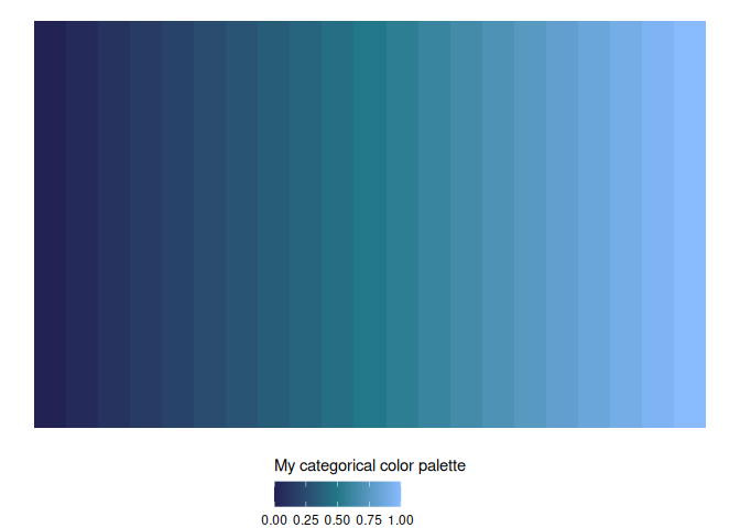
Please email me the code you used to make your plots in a document named week_8_homework_(your_name).R by Tuesday, April 29th.